Typography Projects in CumillaTypography Projects in CumillaBuild Your Strength, Transform Your Body, and Become the Best Version of Yourself at Fitzone Today
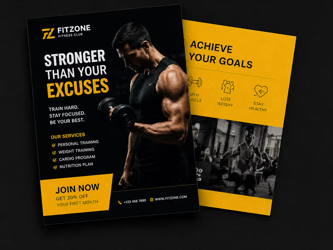
Want a flyer that screams energy, power, and professionalism?
I design high-impact gym and fitness marketing materials that don't just look good — they convert. Whether you're launching a new fitness club, promoting a membership deal, or running a seasonal campaign, I'll create a design that grabs attention and drives action.
What you'll get:
✅ Front & back flyer design (print-ready + digital)
✅ Bold, motivational typography that commands attention
✅ Custom color scheme matched to your brand
✅ Icons, service highlights & CTA section
✅ High-resolution files (PNG, PDF, AI/PSD source)
Perfect for:
🏋️ Gyms & Fitness Clubs
💪 Personal Trainers
🥗 Nutrition & Wellness Brands
🧘 Yoga & Crossfit Studios Modern Company Profile Design Template
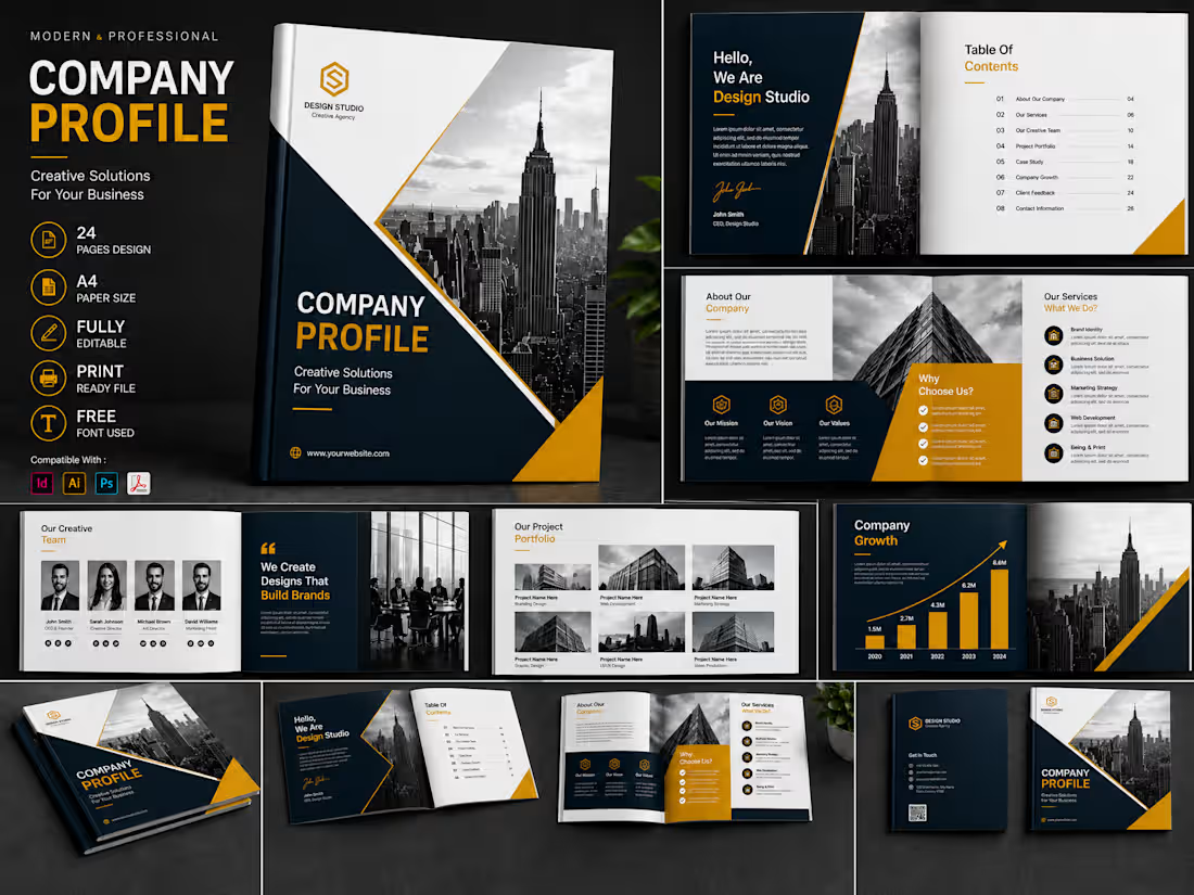
�Present your business in a professional and memorable way with this modern company profile template. Featuring a bold black, white, and gold color scheme, this elegant design is perfect for creative agencies, corporate businesses, startups, studios, and professional brands.
�The template includes 24 beautifully designed pages covering company introduction, services, mission, vision, values, creative team, project portfolio, company growth, why choose us, and contact information. Every element is fully editable, allowing you to customize the text, images, colors, icons, and branding according to your business needs.
Features:
• 24 professional page designs
• A4 paper size
• Fully editable layouts and elements
• Print-ready file
• Modern black, white, and gold design
• Free fonts used
• Easy image and text replacement
• Compatible with Adobe InDesign, Illustrator, Photoshop, and PDF
�Create a powerful company profile that builds trust, highlights your services, and presents your brand with confidence. Elegant Business Flyer & Company Profile Template
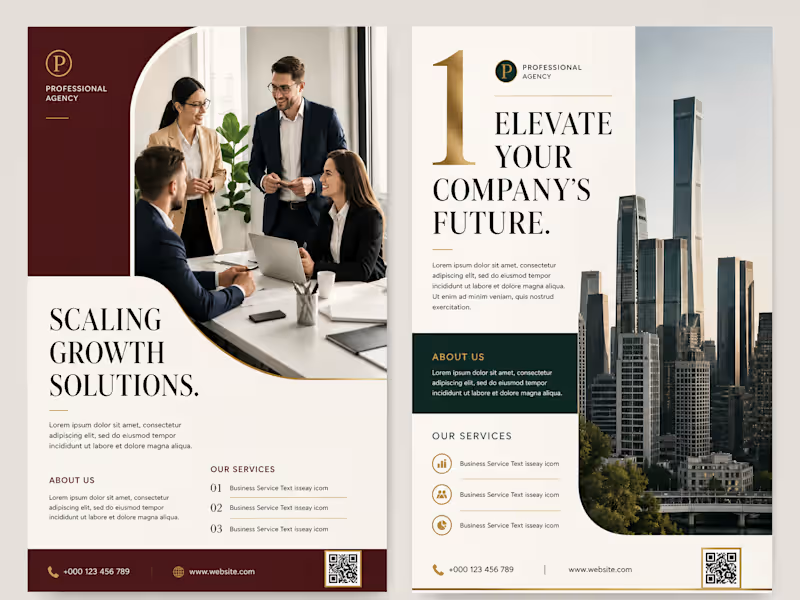
�Present your business with confidence using this elegant and professional business flyer template. Featuring a refined burgundy, cream, dark green, and gold color palette, this design is perfect for agencies, consulting firms, corporate businesses, startups, real estate companies, and professional service providers.
�The layout combines modern business photography, clean typography, structured content sections, and premium visual details to create a strong and trustworthy brand impression. It can be used for company introductions, service presentations, business proposals, marketing campaigns, corporate brochures, and promotional materials.
Features:
• Professional and elegant business layout
• Two coordinated flyer pages
• Clean and well-organized design
• Fully customizable text, colors, images, and branding
• Suitable for print and digital presentation
• High-resolution, print-ready design
• Easy to edit and customize
• Premium corporate style with modern visual elements�
Included Sections:
• Company introduction
• About Us
• Our Services
• Business growth and solutions
• Contact information
• Website and QR code placement
�This template is ideal for businesses that want to communicate their services clearly while maintaining a polished, premium, and professional appearance. Modern Company Profile Template – Creative & Professional Design
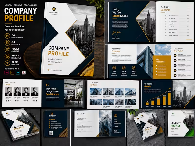
Present your business with confidence using this modern and professional company profile template. Designed with a clean layout, bold typography, and a premium black, white, navy, and gold color scheme, this template is perfect for creative agencies, startups, corporate businesses, marketing firms, and professional service providers.
The template includes 24 fully editable A4 pages with well-organized sections for your company introduction, services, creative team, project portfolio, case study, company growth, client feedback, and contact information.
Features:
• 24 professionally designed pages
• A4 paper size
• Fully editable files
• Print-ready layout
• Free fonts used
• Clean, modern, and professional design
• Easy to customize text, colors, images, and branding
• Compatible with Adobe InDesign, Illustrator, Photoshop, and PDF
Whether you are preparing a company presentation, business proposal, agency profile, or corporate portfolio, this template will help you create a strong and professional brand impression.
• Files Included:
• INDD file
• AI file
• PSD file
• PDF preview
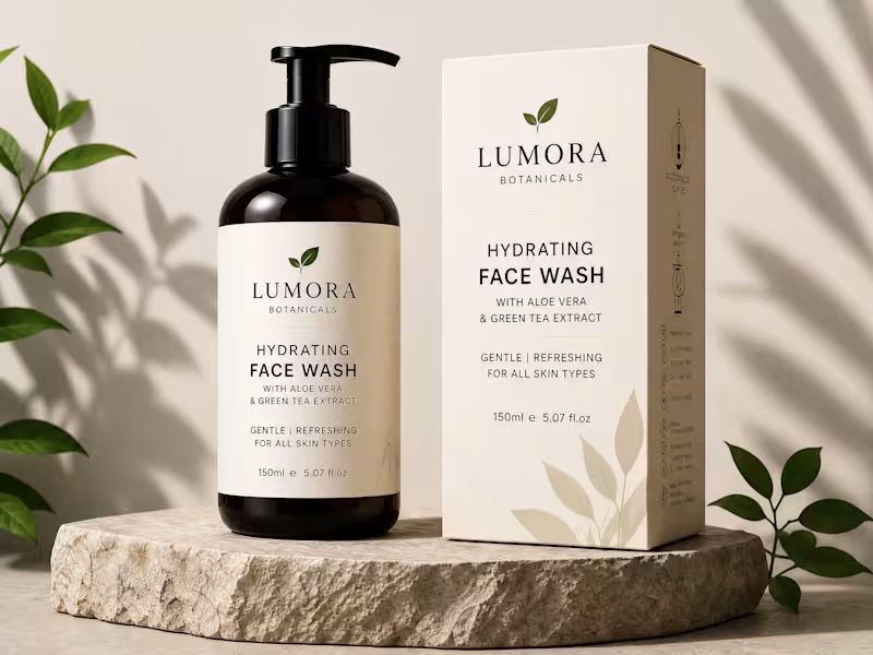
• Help documentation This is a premium skincare product photograph featuring a fictional-looking/branding concept for Lumora Botanicals Hydrating Face Wash.
Product: A 150 ml / 5.07 fl oz face wash, presented in a dark amber pump bottle alongside its matching carton.
Positioning: The packaging emphasizes a gentle, refreshing, botanical skincare identity, with aloe vera and green tea extract highlighted.
Visual style: The image uses warm beige tones, natural stone, soft sunlight, and surrounding green leaves to communicate clean beauty, nature, calmness, and premium quality.
Composition: The bottle and box form the central focal point, with the stone pedestal creating separation from the background. Diagonal shadows and foliage add depth without distracting from the product.
Branding: “LUMORA BOTANICALS” is prominently displayed with a simple leaf emblem, giving the package a minimalist, upscale aesthetic.
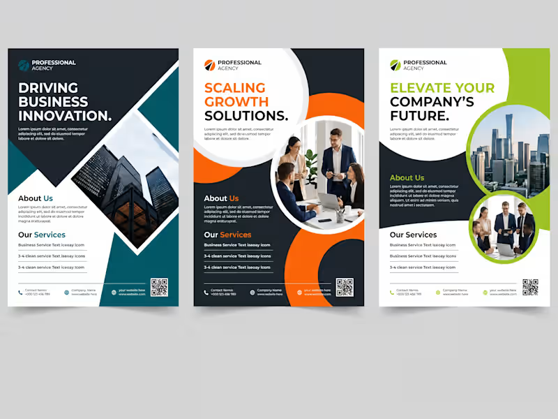
I also found a current Lumora Botanicals site describing the brand as botanical body care with an emphasis on natural ingredients, vegan/cruelty-free positioning, and sustainability, although I couldn't verify that this exact face wash shown in the image is an actual product in its current catalog. This work is a corporate flyer design series for a professional business/consulting agency, presented as three coordinated visual concepts.
Strong corporate identity: Each version uses a dark navy foundation with a distinctive accent color—teal, orange, or lime green—giving the series a modern, energetic business feel.
Clear messaging: Headlines such as “DRIVING BUSINESS INNOVATION,” “SCALING GROWTH SOLUTIONS,” and “ELEVATE YOUR COMPANY’S FUTURE” immediately establish the intended value proposition.
Dynamic layouts: Large geometric shapes, angled sections, circles, and image frames create movement while separating the different content areas.
Photography: The architectural imagery communicates scale and professionalism, while the business-team photographs reinforce collaboration, consulting, and corporate expertise.
Information hierarchy: The designs establish a clear progression from headline to supporting information, services, and contact details. This kind of hierarchy helps viewers scan a flyer quickly rather than reading it line by line.
Practical marketing focus: QR codes, contact information, service sections, and website details make these more than decorative layouts—they are designed as business communication and lead-generation materials.
The three versions also demonstrate how a single corporate design system can be adapted through different color palettes and imagery while retaining a recognizable structure. The main opportunity for refinement would be reducing some of the small placeholder-style text and ensuring one especially prominent call-to-action; keeping copy concise and scannable generally strengthens flyer effectiveness.
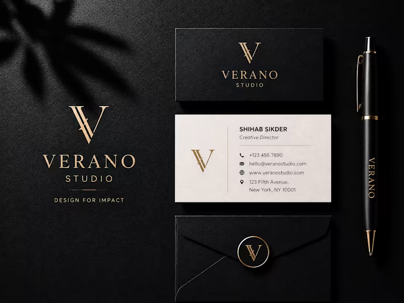
Overall, the work communicates growth, professionalism, innovation, and corporate confidence, with a contemporary agency-oriented visual language. This work is a luxury brand identity presentation for “Verano Studio,” built around a refined, editorial aesthetic.
Visual direction: Deep black, warm ivory, and muted gold create a premium, sophisticated feel. The gold foil-like accents add a sense of craftsmanship and exclusivity.
Logo: The interlocking “V” monogram is the central brand element, repeated consistently across the card, envelope seal, pen, and larger background mark. This gives the identity strong visual cohesion.
Typography: The elegant high-contrast serif lettering in “VERANO” contrasts nicely with the cleaner sans-serif typography used for the contact information, balancing luxury with professionalism.
Brand system: Rather than presenting only a logo, the design demonstrates how the identity works across business cards, stationery, packaging, and branded objects. That makes it feel like a complete visual identity rather than an isolated logo.
Photography/mockup: The textured black surface, directional shadows, and subtle material details make the presentation feel tactile and premium.
Overall impression: It communicates creative direction, exclusivity, confidence, and attention to detail—a strong fit for a boutique design or creative studio.
One small branding note: “Verano” is Spanish for “summer,” which could subtly reinforce ideas of warmth, elegance, and lifestyle depending on the intended brand story.
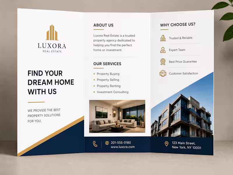
Overall, the strongest aspect is the consistency of the visual language: the monogram, gold accents, typography, dark materials, and restrained color palette all reinforce the same premium positioning. This is a professional tri-fold real estate marketing brochure for a fictional brand, Luxora Real Estate. The overall direction is premium, trustworthy, and corporate.
What works well
Strong visual hierarchy: The large “FIND YOUR DREAM HOME WITH US” headline immediately establishes the purpose.
Luxury color palette: Navy, white, and gold communicate stability and upscale positioning.
Clear information structure: The brochure separates the brand message, “About Us,” services, benefits, and contact information into easily scannable sections.
Good use of photography: The interior and exterior property images make the service feel tangible rather than purely corporate.
Consistent branding: The gold architectural logo, gold accents, and navy footer create a cohesive identity throughout.
Appropriate brochure format: The tri-fold format works particularly well for a real-estate agency because it lets the reader move from introduction → services → reasons to choose the agency → contact information.
Design character
The aesthetic sits somewhere between luxury property marketing and modern corporate branding. The generous white space keeps it from feeling overly ornate, while the architectural imagery reinforces the real-estate theme.
One thing I would improve is the small body copy and some of the dense information areas. For a printed brochure, readability and sufficient spacing around folds are important, and the final print file should also account for bleed and fold tolerances.
Overall, it’s a clean, polished concept designed to make the agency look established, reliable, and premium.