Rhinohed II: our own browser game, part two. A rhino rips robots apart and wears their parts.
We built it in about three days by taking AI tools apart: 8 levels, 2 bosses, his voice and a narrated trailer. Then 9 testers played it, and the data showed level one was far too hard. The whole story, with the trailer and playtest charts: https://bradyux.com/experiments/rhinohed-ii/
2
55
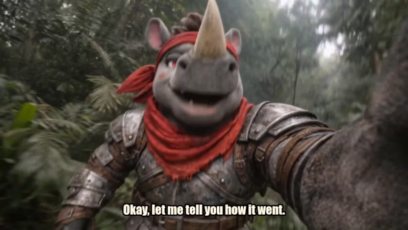
Rhinohed II is our gory, ridiculous action game. A rhino rips robots apart and uses their parts as weapons.
For the trailer, we wanted it to feel like a real game launch: wall-to-wall action from the first second, a character voice with some personality, and jokes that land. Everything in it is real gameplay, with the game’s own sound effects and music. The opener and the bloody selfie gag are a cinematic version of the character, built to stop the scroll.
What went into it:
• Game and character design
• Original soundtrack and 40+ sound effects
• Character voice and script
• Trailer edit, captions and sound mix
• Logo and title screen
Want a trailer, a launch video or a whole world built for your product? Let’s talk.
3
64
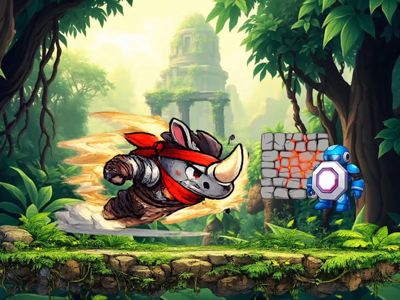
Rhinohed: a side-scrolling game you can play in your browser, no download or login. A rhino in a red bandana charges through a jungle and a refinery to smash a robot core.
It started as an old prototype, and when we came back to it, the phone controls did nothing and two stages couldn't be beaten. We fixed it properly, so now all three stages can be finished.
Play it: https://bradyux.com/experiments/rhinohed/
0
78
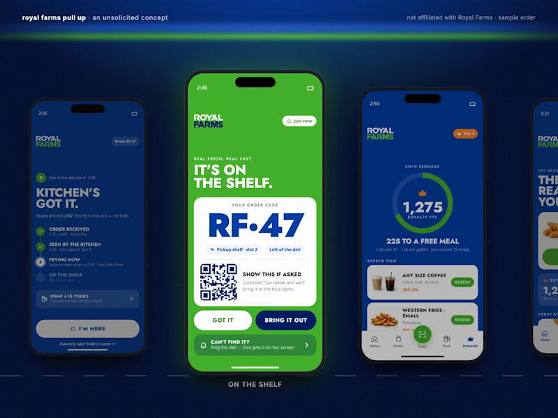
Royal Farms Pull Up: the order went through, and nobody in the kitchen saw it.
An unsolicited concept, not affiliated with Royal Farms. We audited 11 convenience-store apps and read about 150 real reviews, then designed a driver-first order-ahead app in their real brand. A person in the kitchen taps "got it" and you see their name and the time. Pickup shows a big code and the exact shelf slot. Fuel rides along on the same order. Shown with a sample order.
Case study: https://bradyux.com/portfolio/royalfarms/
1
1
98
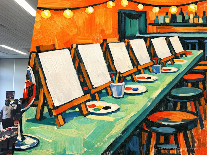
Pub & Paint: the painting-event company I co-founded and ran in Baltimore, DC and Maryland, 2012 to 2018. 110,000+ paid guests in 52 partner venues. I designed the brand, the websites and the ticketing and booking flows, starting with a calendar that told nervous first-timers everything before they paid: the painting, the price, seats left and how hard it was. Case study: https://bradyux.com/portfolio/pubandpaint/
1
0
106
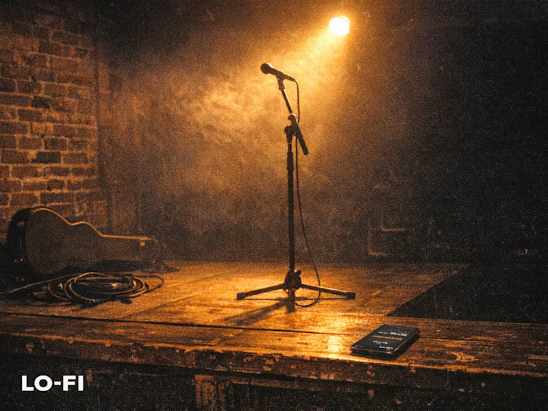
LO-FI: the whole system for a live music venue. It was our own venue, planned for downtown Cumberland, MD, and we designed and built everything it would run on: ticket checkout with no account wall, one QR ticket per person, a phone scanner for the door that shows one answer, big, then "Scan Next Guest", staff roles, refunds, coworking memberships, a front-desk kiosk, and a dashboard for the month. Built before opening, so it's honest about what wasn't decided yet: the name, the hours, even the parking are editable without touching the code. The venue never opened; the system was ready. Shown with sample shows and guests. https://bradyux.com/portfolio/lofi/
1
1
97
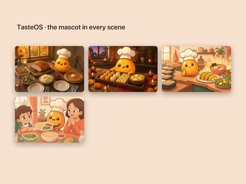
Three blogs, a cover for every post.
I design and run the blogs for TasteOS, pirch and tab, and each one looks like its own product. TasteOS paints its mascot into every scene. pirch gives each post one small object and publishes original research with its sources. tab pairs practical notes for freelancers with art that never repeats a medium.
Case study: https://bradyux.com/portfolio/blogs/
2
2
174
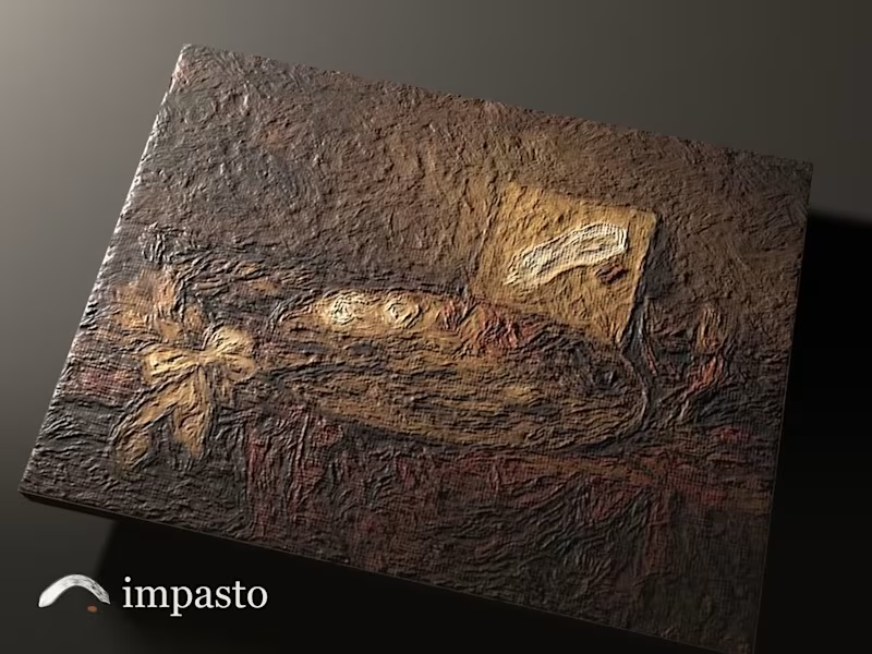
impasto: an iPad oil painting app where the paint has real thickness.
I trained as a painter at the Schuler School, and digital paint always skipped the part I loved: the weight of a loaded brush, paint that's still wet tomorrow, a surface you can sand, glaze and varnish. In impasto the paint has height, mixes the way pigment does, and dries on its own clock. To put it through its paces, an AI painter worked through a set of test paintings in the app, sitting by sitting, while I coached it the way I was taught.
Everything in this film is the app's own output. Each painting's colour and paint thickness came straight out of impasto and was lit in 3D, so the ridges you see are the real ones. The panels are the real interface. Free beta on iPad with Apple Pencil: impasto.bradyux.com
0
98
Blurt: an app builder you talk to. A concept for teens and anyone who learns differently: you say what you want, it builds it step by step, and the next idea is always one big button. Four research reports came first, then a design system with one rule (the tool stays quiet, your app is the star), then three rounds of testing. Shelved on purpose, and still one of my favourite pieces of thinking. https://bradyux.com/experiments/blurt/
0
95
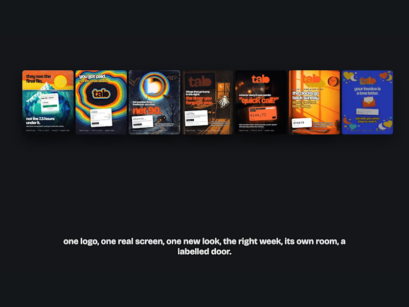
A rulebook, not a template.
Most startup marketing is one template on repeat. For tab, our freelance time tracker, we wrote rules instead, and every poster has to follow all of them:
The logo leads. tab doesn't have one logo, it has thirty-three.
The screen is real. A poster is a promise, so the product has to keep it.
Never the same look twice.
Only say what's true this week.
Every poster gets its own landing page, built from the same art, with a real clock you can start right there.
Every link is tagged, so we know which room people walked in from.
Fourteen posters so far, no two alike. Watch the tour above.
Follow along: Tab Work on Instagram and Facebook, Tab on LinkedIn, or try it free at tabwork.app (http://tabwork.app)
1
2
216
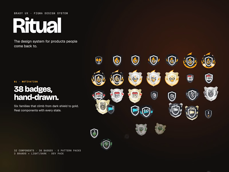
ritual is live.
it's a figma design system for products people come back to. the usual parts are there (32 components, light and dark), but the reason it exists is the stuff kits skip: the first five minutes, the streak, the alert at 2pm, the ai answer you need to trust, the bill you need to understand.
what's in it:
38 hand-drawn badges as real components, with locked, in progress, new and earned states
streaks that forgive a missed day
five pattern packs: motivation, first run, status, trust & ai, money
three brands in light and dark, one switch
a dev pack with tokens and a tailwind preset
every page covers design, prototype and build, so nobody has to guess.
link in the first comment.
2
3
285
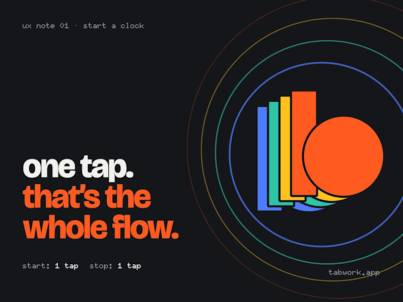
ux note 01: one tap.
i've been designing and building my own product on the side. it's called tab, a clock for freelancers that turns your hours into an invoice your client actually pays.
the rule i kept coming back to: starting the clock should take less effort than forgetting to. so it's one tap. no project picker, no forms, no "what are you working on?" pop-up. tap the client, the clock runs. tap again, it stops.
everything else (notes, links to the work, the invoice) can wait until later. the start can't.
it's free and in beta, so if you bill by the hour, i'd love to know what feels off.
tabwork.app
1
2
584
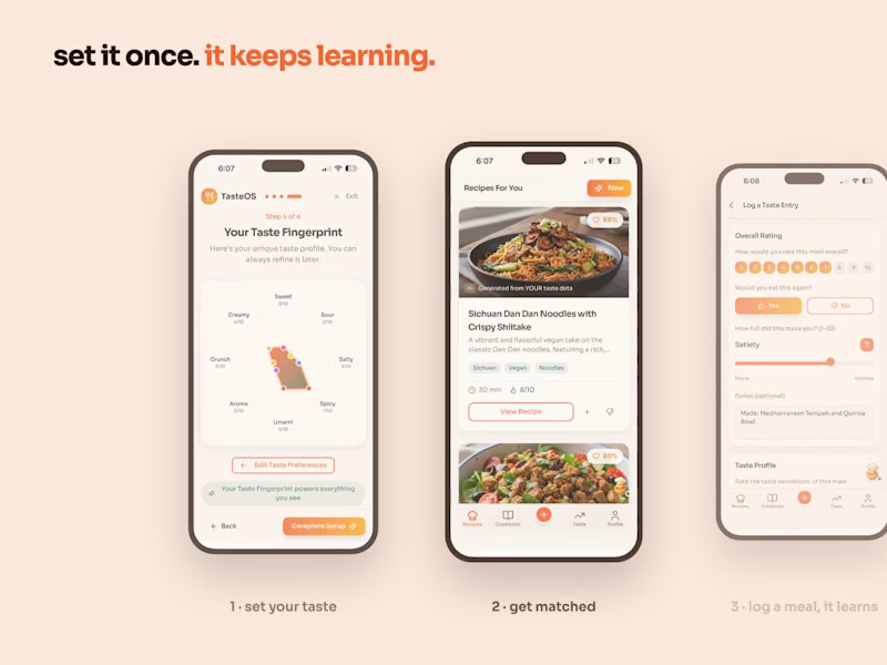
Turning taste into a fingerprint: the screen that powers every TasteOS recipe.
Most recipe apps ask what you like once and forget it. TasteOS builds a taste fingerprint (sweet, sour, salty, spicy, umami and more) during setup, then sharpens it every time you log a real meal and rate it. Every recipe it suggests shows how well it matches that fingerprint.
Live on the web and the App Store. https://tasteos.app
2
1
369
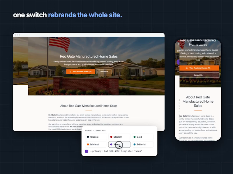
Yard: a website platform for manufactured-home dealers. After designing dozens of dealer sites, I kept seeing the same inventory backend rebuilt for every client, so I designed it once as a platform: one shared system, six templates, and brand colors as tokens, so a single switch rebrands the whole site. Case study: https://yard.figma.site
1
361