
Passionate Graphic Designer & Copywriter
Passionate Graphic Designer & Copywriter


View more →

Transforming Information into User-Centric Designs
Transforming Information into User-Centric Designs


Graphic Designer & Illustrator
Graphic Designer & Illustrator


Versatile designer uniting identity and interaction.
Versatile designer uniting identity and interaction.

Just wrapped up a full refresh of my portfolio new projects, refined visuals, and a latest story behind my work. Excited to connect with brands and founders worldwide who value thoughtful design and creative collaboration.
Check it out here 👇
rifkyardiansyah.site
Always open to new opportunities through Contra 💼
0
144
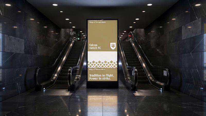
Here is how I create visual identity with expansive with Envato. Almost used everything in Envato site.
Check on my Instagram too!
https://www.instagram.com/reel/DbSWtx1xwPT/?igsh=b2l4NWx2cHdkcXlz
1
163
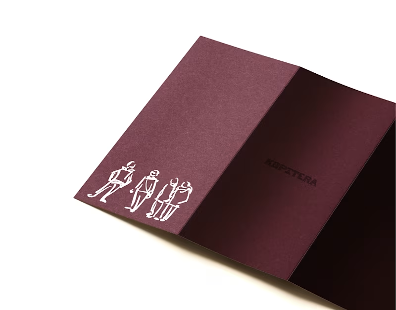
Rebranding works for Kopitera with Studio Dure, exciting project when i had to explore a simple brush illustration style.
Located in the heart of Bandung, Indonesia, Kopitera appears as a warm and familiar classic café. Since 2017, Kopitera has offered a soft and comfortable space where coffee and everyday life meet in quiet harmony.
#rebranding:
0
87
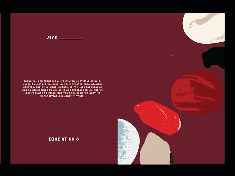
Crafting an exclusive keepsake collection for Dine at No. 8 , where fine dining meets thoughtful design.
Each guest receives a custom keychain and a mini memory photo card, subtle details that turn every dining experience into something personal and memorable. ✨🍽️
Excited to connect with brands and founders worldwide who value thoughtful design and creative collaboration.
Check it out here 👇 https://rifkyardiansyah.site
Always open to new opportunities through Contra 💼
0
151

Multidisciplinary graphics designer with 5+ years experience
New to Contra
Multidisciplinary graphics designer with 5+ years experience
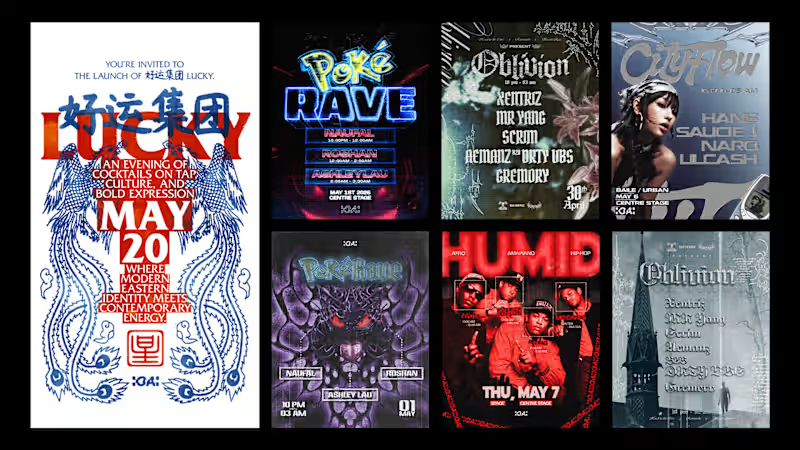
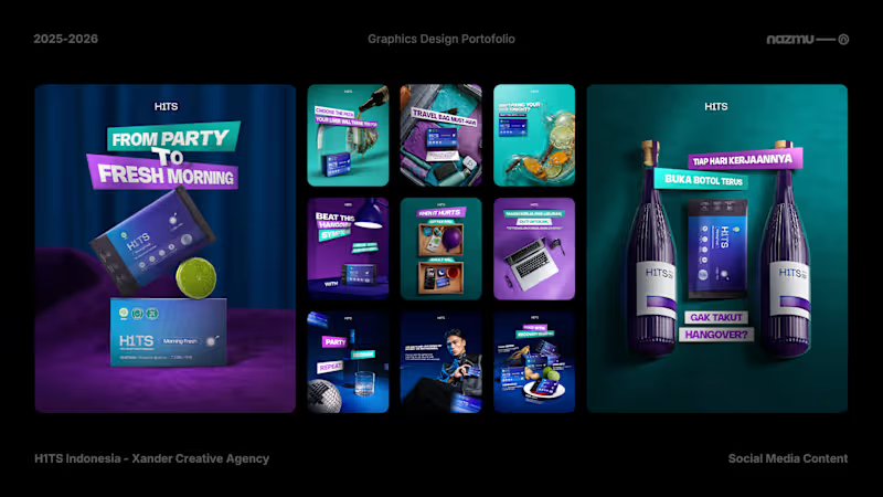

H1TS is a Korean-inspired, plant-based herbal beverage brand designed to help young adults unwind and refresh. I contributed to the brand’s visual communication by developing a cohesive graphic design direction across product marketing materials, promotional visuals, and digital brand assets.
The visual approach combines bold typography, vibrant colors, dynamic compositions, and contemporary lifestyle imagery to create an energetic identity that resonates with young professionals and social drinkers. The goal was to communicate the brand’s personality consistently while making its marketing visuals engaging, distinctive, and memorable.
0
15

Brand Strategist & Art Director
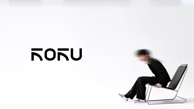
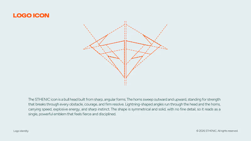
In this case i make a design and direction for an identity of STHENIC.
Sthenic is a Muay Thai brand making fight gear with streetwear concept. I explore and make an urban direction for STHENIC so it will looks as a young urban without losing context of sport brand itself. Every looks in the social media and imagery will took every audience journey and feel about how strong, modern, and authentic of Sthenic.
I build direction and design for all the identity that includes primary and secondary logos, a brand mark, a color palette, a typography system, and a logo guidelines, imagery, artdirection, imagery, partnership, etc.
0
15
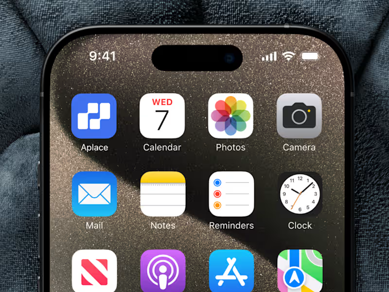
Aplace. Real Estate Brand Identity and UI/UX Design
Finding a place to call home is more than a property search. It is a decision shaped by personal needs, lifestyle, and future plans. Yet navigating property listings can often feel overwhelming, especially when information is difficult to compare and the digital experience lacks clarity.
Aplace is a conceptual digital real estate platform designed to simplify how people discover, buy, and rent properties. The project explores how brand identity and digital product design can work together to create a more intuitive experience, helping users move through the property discovery process with greater confidence.
The Challenge.
The challenge was to create a cohesive brand and digital experience for a platform that brings property discovery into one accessible interface. The design needed to communicate trust and clarity while presenting property information in a way that feels structured, approachable, and easy to navigate.
The Process.
Research and Exploration.
The project began by considering the needs of users navigating digital property platforms. Searching for a property involves more than browsing images. Users need to understand listing details, compare options, and navigate information efficiently before making an important decision.
These considerations informed the design direction, with an emphasis on clarity, usability, and a consistent experience across the brand and digital interface.
Brand Concept Development.
Aplace was developed around the idea of making property discovery feel more accessible. The name suggests a destination, a space, or somewhere to belong, connecting the practical function of a real estate platform with the personal meaning people associate with finding a place.
This concept provided a foundation for a brand that feels approachable and contemporary while maintaining the credibility expected from a property related service.
Visual Identity and Direction.
The visual direction focused on creating a clean, modern, and cohesive brand presence. Rather than relying on unnecessary visual complexity, the identity emphasizes clarity and consistency, allowing the brand to communicate its purpose through a straightforward visual language.
The objective was to establish an identity that could translate naturally into a digital product, ensuring that the brand and interface felt like parts of the same experience.
UI/UX Design.
The interface design translated this direction into a structured digital experience. Layouts, information hierarchy, and navigation were considered to help users understand property listings and move between relevant information more intuitively.
The design prioritizes the presentation of property details, creating a clear visual structure that supports browsing and comparison. The interface aims to reduce unnecessary friction by making essential information easier to identify and the overall experience easier to follow.
Brand and Digital Integration.
An important part of the project was connecting the visual identity with the user interface. Typography, visual hierarchy, and the overall design language were approached as a unified system rather than separate design exercises.
This integration helps maintain consistency between how Aplace presents itself as a brand and how users experience it through the platform.
The Result.
Aplace brings brand identity and UI/UX design together in a conceptual real estate platform built around clarity, accessibility, and trust. The project establishes a visual and digital direction that supports the practical needs of property discovery while recognizing the personal significance of finding a place to live.
By connecting brand expression with interface design, Aplace demonstrates how a cohesive digital experience can make a complex service feel more organized, approachable, and intuitive.
1
78
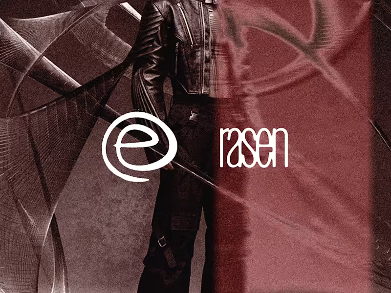
Rasen. Rebellious Streetwear Logo Identity and Visual Direction
Rasen is a streetwear brand built around the idea of breaking away from conventional patterns. Its name is derived from the Japanese word for spiral, a form that represents movement, repetition, and continuous progression. This became the starting point for a brand that challenges the routines and expectations that often shape everyday life.
Inspired by grunge, punk, and futuristic streetwear, Rasen speaks to individuals who refuse to be defined by the ordinary. It represents a mindset that questions conformity, embraces individuality, and encourages people to find their own way of expressing themselves. The brand's tagline, "Break from the Center," captures this philosophy, inviting people to step outside familiar patterns and explore an identity of their own.
The Challenge.
The challenge was to translate an abstract philosophy about individuality and breaking conventions into a recognizable streetwear identity. Rasen needed to communicate rebellion without relying on generic punk imagery, while bringing together the raw character of grunge and the forward looking attitude of futuristic fashion.
The Process.
Research and Exploration.
The project began with exploring the relationship between streetwear, subculture, and personal identity. Grunge and punk provided a foundation rooted in resistance and nonconformity, while futuristic fashion introduced a more experimental visual perspective. Alongside these references, the meaning of the spiral offered a conceptual connection to repetition, movement, and the desire to escape established patterns.
This exploration helped define the creative direction for Rasen, positioning the brand at the intersection of underground culture and unconventional self expression.
Brand Concept Development.
The central concept developed around the idea of breaking away from the center. Rather than treating the center as a literal location, it represented the established norms and repetitive routines that people are often expected to follow. Rasen was conceived as a brand for those who want to challenge these expectations and create their own paths.
The spiral became a meaningful conceptual reference for this idea. Its continuous movement could suggest repetition, but also the possibility of moving beyond a familiar cycle. This duality helped shape the brand's philosophy and connect its name with its attitude.
Visual Direction.
The visual direction combined the roughness of grunge, the rebellious energy of punk, and the experimental character of futuristic streetwear. The goal was to create an identity that felt unconventional and expressive rather than polished according to mainstream fashion standards.
This direction established the visual character of Rasen as a brand that embraces contrast, challenges expectations, and treats personal style as a form of self expression.
Identity Development.
I developed the logo and visual direction to translate the brand concept into a cohesive identity. The design approach focused on giving Rasen a recognizable visual character that aligned with its rebellious philosophy and alternative fashion influences.
The identity was intended to communicate the brand's attitude beyond its name alone, connecting the underlying concept with the visual language of its streetwear positioning.
The Result.
Rasen brings together a conceptual foundation and an alternative fashion aesthetic to create a streetwear identity centered on individuality and rebellion. Its name, philosophy, and visual direction work together to express a clear point of view, challenging the idea that personal identity must follow established patterns.
Through the concept of "Break from the Center," Rasen positions streetwear as more than clothing. It becomes a means of rejecting conformity, exploring personal identity, and expressing a different way of seeing the world.
0
44

Professional Sports Branding | Logo, Jersey, & Apparel Desig
Professional Sports Branding | Logo, Jersey, & Apparel Desig


View more →