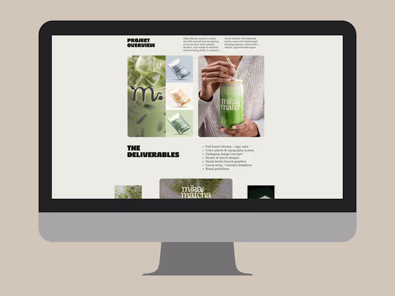
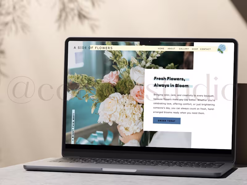
Projects in AndalusiaProjects in AndalusiaDesigning the Four Winds website allowed me to bring a mission-driven brand to life online through thoughtful layout, intentional storytelling, and a user experience that feels as warm and welcoming as the community it represents. I focused on creating a clean, intuitive structure that highlights their offerings while weaving in nature-inspired visuals, grounded color palettes, and clear calls to action. My goal with every web project is to build a digital space that feels aligned, easy to navigate, and reflective of the heart behind the brand, blending aesthetics with strategy so visitors feel connected, informed, and inspired to take the next step. ✨ Get Fizzy With It — Mini Brand Design
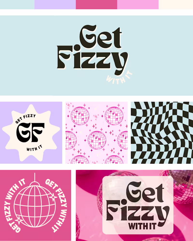
A playful, retro-inspired brand concept built around energy, movement, and feel-good fun. The visual identity blends nostalgic disco aesthetics with a modern twist, think groovy typography, sparkling disco balls, and bold, attention-grabbing patterns.
This mini brand suite includes a primary logo, a quirky monogram mark, custom patterns, and social-ready graphics designed to bring the brand’s lively spirit to life across every touchpoint. From warped checkerboard textures to star-studded disco ball motifs, each element reinforces the brand’s playful, fizzy vibe.
The result is an energetic micro-brand that feels youthful, dynamic, and ready to party, perfect for a beverage, lifestyle, or event-based brand looking to stand out with style and personality. 🌿 Four Winds — A Collective for Outdoor Entrepreneurs
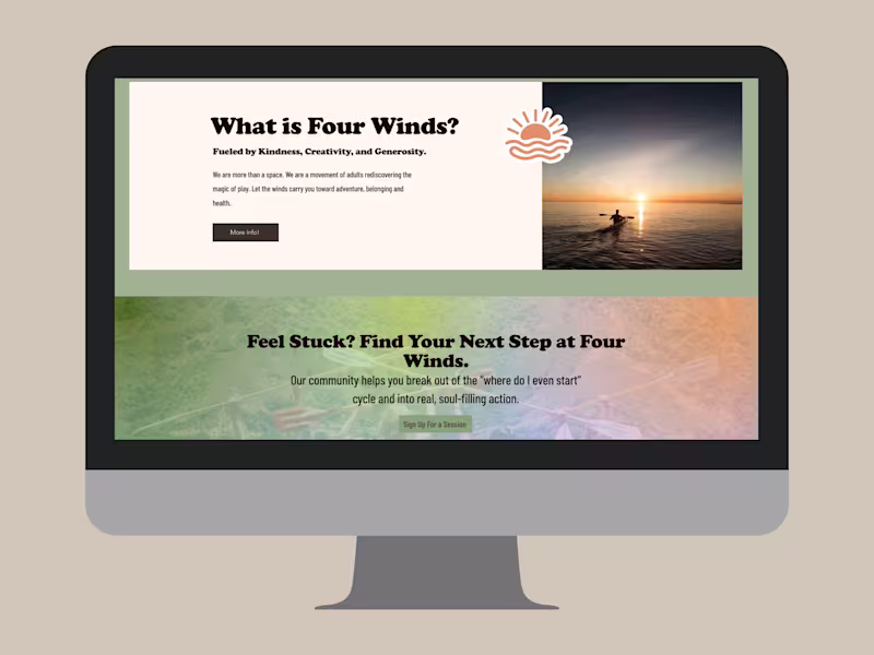
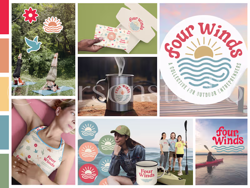
Four Winds came to Corson Studio with a vision: to build a brand that celebrates community, creativity, and the great outdoors. They wanted to inspire adventure while empowering women-led entrepreneurs to collaborate and grow together.
We developed a brand identity rooted in balance, where wellness meets business and creativity meets nature.
The color palette draws from sunrise hikes and earthy trails, while the logo captures the energy of movement, wind, and water. Each icon and graphic was designed to feel approachable yet adventurous, reflecting their mission to create a supportive, judgment-free community.
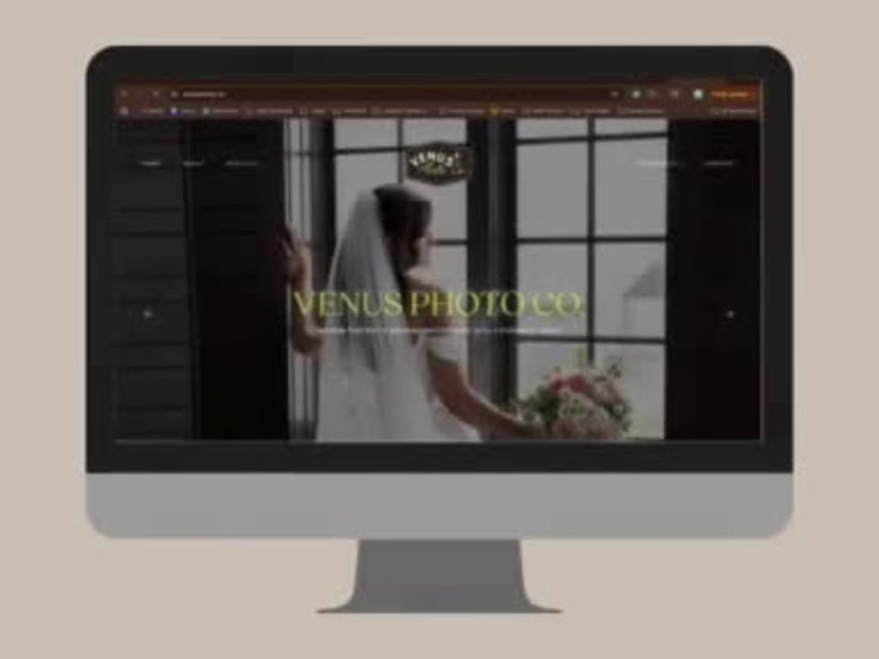
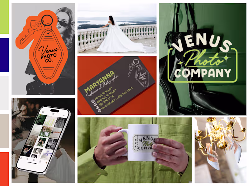
✨ Brand identity, color palette, icon suite, and merch design by Corson Studio. Venus Photo Co. already had the talent, the clients, and the charm, but their branding wasn’t keeping up. The logo was simple, their online presence lacked consistency, and their visual story didn’t reflect the personality their clients fell in love with.
My goal was to help them transform their scattered visuals into a cohesive identity system that actually feels like Venus.
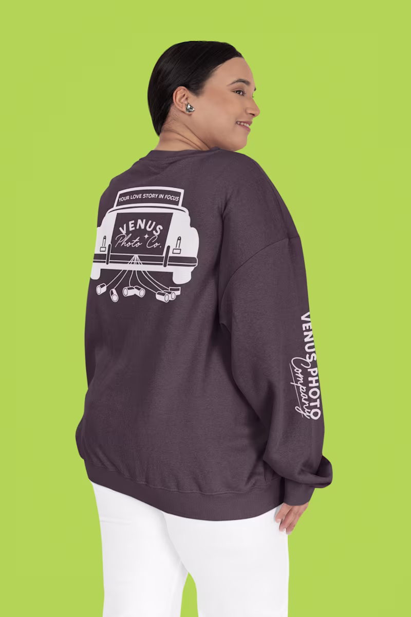
We focused on personality-driven branding: expressive typography, playful retro motifs, and versatile logo marks that work beautifully across packaging, apparel, and social.
Now, their brand tells the same story their photography does, bold, creative, and full of heart.
This rebrand is more than a facelift, it’s a foundation for how their business shows up moving forward.
📸 Brand transformation by Corson Studio When Venus Photo Co. came to me, they already had a thriving photography business, but their visuals didn’t fully capture the magic behind the lens. Their brand was warm, nostalgic, and full of personality, but their logo felt disconnected from that energy.
Our goal was to craft a visual identity that felt like them: confident, retro-inspired, and effortlessly cool.
We focused on brand consistency and recognition, refining everything from typography to tone. The new system includes bold logos, cohesive colors, and personality-packed merch that shows their brand story, whether it’s on social, print, or packaging.
The result? A brand that finally reflects their creative power and connects instantly with their audience.
Because great photography deserves an equally striking visual identity.
🎨 Full brand design by Corson Studio.