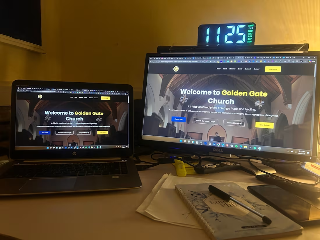
Just launched a FULL church website on GoHighLevel ,and honestly, this might be my cleanest build yet.
Most people think GHL is only for funnels…
But when you understand UI/UX + layout hierarchy, you can build beautiful, functional, community-driven websites too.
🔥 Built for: Golden Gate Church
✔ Modern hero section
✔ Weekly schedule
✔ Ministries layout
✔ Community outreach section
✔ Map + contact
✔ Optimized for mobile
✔ Fully editable inside GoHighLevel
Churches deserve websites that feel alive, not outdated flyers uploaded online.
If your ministry or organization needs a clean, modern site that builds trust at first glance…
My inbox is open. 🙏✨
1
2
354
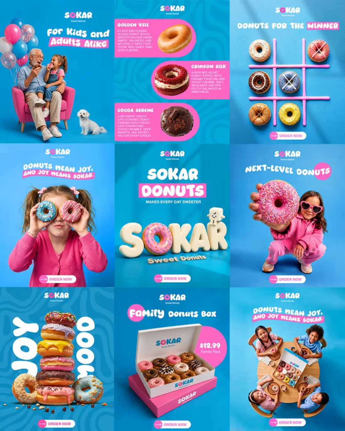
SOKAR Donuts | Social Media Campaign
A fun, vibrant, and visually engaging social media campaign created for SOKAR Donuts to bring the brand’s playful personality to life online.
The creative direction combines bold branding, colorful visuals, and eye-catching food advertising to make the products instantly appealing to a social media audience. Each design was created to showcase the donuts while maintaining a cohesive visual identity that feels energetic, memorable, and instantly recognizable.
This campaign demonstrates how strong visual storytelling, creative marketing, and strategic social media design can help a food and dessert brand stand out, build brand recognition, and create content that captures attention and encourages engagement.
Social Media Design • Content Creation • Social Media Marketing • Graphic Design • Brand Strategy • Creative Direction • Content Strategy • Instagram Marketing • Digital Marketing • Visual DesignSOKAR Donuts | Social Media Campaign
2
7
489
Project Title
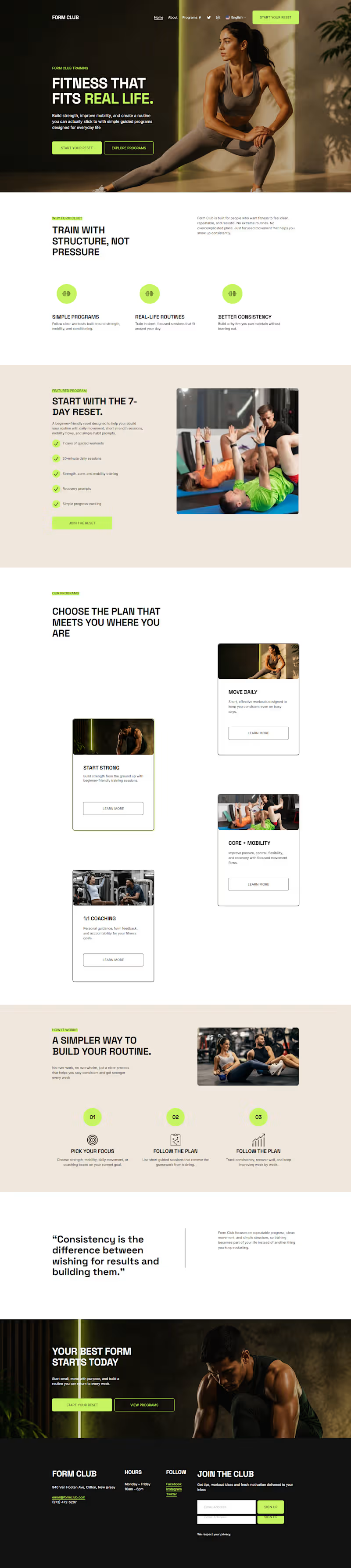
Form Club: Fitness That Fits Real Life
Website Link
Website URL: https://dodecahedron-pike-2p5h.squarespace.com/
(https://dodecahedron-pike-2p5h.squarespace.com/)password: Formclub2026
Social Post Link
https://www.instagram.com/p/DbKa1VtIeWQ/?igsh=MzhnbXI2a3ppc3g4
Project Description
Form Club is a modern fitness brand homepage built with Squarespace for the Make It Real Challenge. The concept is centered around one clear idea: fitness should fit real life.
The homepage introduces a clean, premium fitness experience for people who want simple, structured, and realistic training. It highlights the main offer, The 7-Day Reset, along with program previews like Start Strong, Move Daily, Core + Mobility, and 1:1 Coaching. The goal was to make the brand feel polished, approachable, and ready to launch from a single focused homepage experience.
The design uses a strong visual system with deep charcoal, warm off-white, energy lime accents, bold typography, premium fitness visuals, and clear calls to action. I also enabled multilingual support to make the site more accessible for a global audience.
Finish Layer / Squarespace Design Tools Used
I used Squarespace’s built-in design tools and Finish Layer features to make the homepage feel more custom and polished. This included:
Subtle block animations for key sections and calls to action
Layered visual elements in the hero and featured program areas
Transformed floating cards to create depth and movement
Mobile layout adjustments to keep the homepage responsive and readable
Consistent typography and color styling across the full page
These details helped turn the idea into a polished, functional, and globally accessible fitness brand homepage.
Key Design Decisions
The homepage was designed as a focused one-page brand experience. I used a clear structure so visitors can quickly understand the brand, explore the main program, and take action.
Key decisions included:
A bold hero section with the message “Fitness that fits real life.”
A featured program section for The 7-Day Reset
Program cards to make the brand feel complete and functional
A simple “How It Works” section to improve user experience
A final call-to-action section to guide visitors toward starting their reset
A multilingual setup to support a broader audience
Video Walkthrough Link
https://www.awesomescreenshot.com/video/54888659?key=3b86350c7dee6fa5ab8b9b563de33f32
(https://www.awesomescreenshot.com/video/54888659?key=3b86350c7dee6fa5ab8b9b563de33f32)
2
212
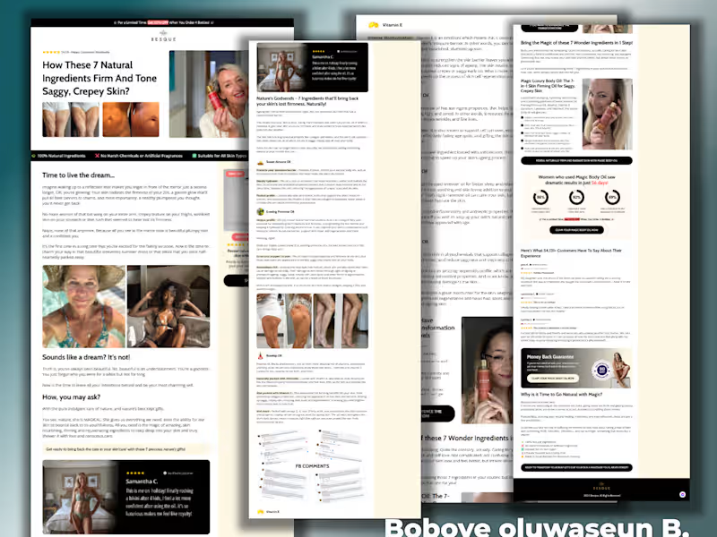



StomatraLaunch Carousel Post Design
Social media success isn't about posting more, it's about posting smarter. That's the approach behind this carousel design created for StomatraLaunch.
Designed using Figma and Adobe Photoshop, this carousel was crafted to communicate key messages through clean layouts, engaging visuals, and a structured content flow that keeps viewers swiping. Every slide was designed with readability, brand consistency, and audience engagement in mind.
Tools Used:
Figma
Adobe Photoshop
Services Included:
Carousel Design
Social Media Graphics
Visual Content Design
Brand-Aligned Layout Design
9
18
1.2K