
Creative Branding & Packaging Design Specialist
Creative Branding & Packaging Design Specialist


View more →


Brand Designer | Identity Systems | Social & Print |
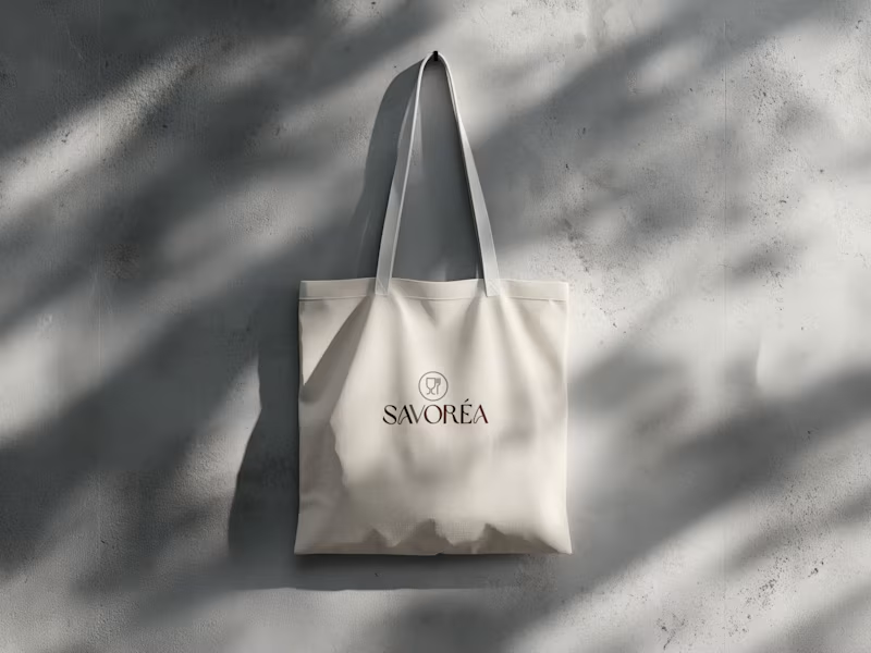
Food & Beverage Brand Identity & Marketing Design
This project focuses on creating a clean and consistent brand identity for a food & beverage brand, applied across both print materials and social media.
The goal was to build a simple visual system that ensures clarity, balance, and brand consistency across all touchpoints. The identity includes logo design, color and typography direction, print applications, and social media layouts, all developed with a minimal and professional approach.
The result is a cohesive branding system that supports clear communication and a strong, reliable brand presence.
6
12
411
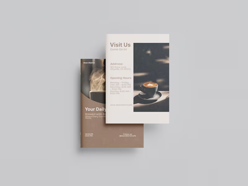
Brochure design for a cafe brand.
“A minimal, modern brochure design featuring clean lines, balanced layouts, and a refined aesthetic that reflects the café’s warm, contemporary atmosphere.”
3
273
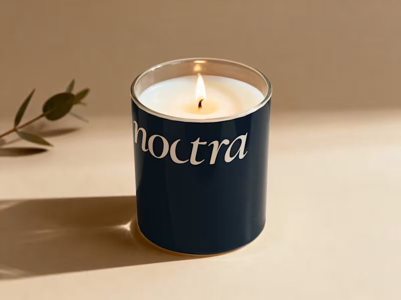
Most coffee brands compete on intensity. Bold colors, aggressive typography, slogans built around hustle and momentum. Even premium specialty brands tend to lean on origin stories, roasting data, and café culture aesthetics.
Noctra is a specialty coffee brand built for the quiet hours — the moments between dusk and dawn when the world slows down and you finally have time to just exist. In a market that shouts energy, speed, and productivity, Noctra whispers something different: stillness is not emptiness. Darkness is not absence. And a good cup of coffee deserves more than a rushed morning.
The goal was to build a brand that feels like the last hour before sleep or the first hour before the world wakes — warm, intentional, and deeply present.
6
9
314
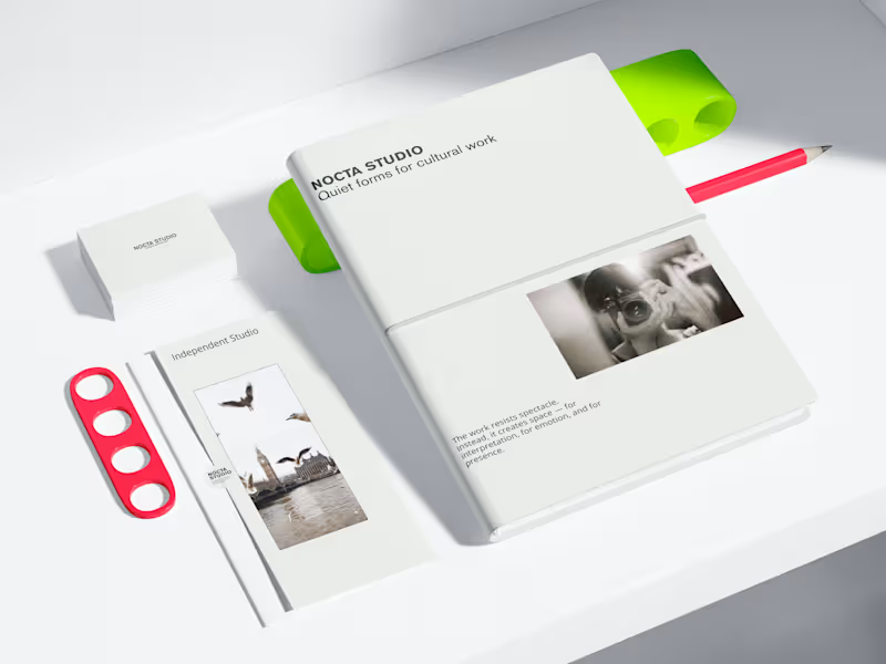
NOCTA STUDIO — Brand Identity & Editorial System
NOCTA STUDIO is a conceptual brand identity project for an independent cultural studio working with artists and filmmakers.
The identity is built around emotional restraint, clarity, and a system-driven approach to typography and layout. The goal was to create a flexible visual language suitable for editorial, print, and digital applications.
This project demonstrates my approach to minimal branding and content systems.
Services
Brand identity design
Editorial design
Visual systems for social & digital
Print & digital mockups
Check my full work
https://www.behance.net/anukumari4567
3
234

Logos. Brand. Posters. Systems. Designed with precision.
Logos. Brand. Posters. Systems. Designed with precision.

A formal letterhead design created for The Heritage Educational Infotech Society.
Built around structure, clarity, and institutional balance — combining brand colors with a minimal layout and strong document hierarchy.
Designed for professional correspondence and official communication.
2
183
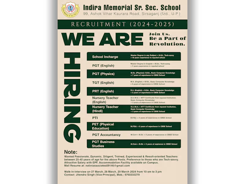
A clean, recruitment-focused poster design— crafted for high visibility, readability, and trust.
The layout balances hierarchy and typography to make every qualification stand out clearly.
Delivered in both colour and monochrome for print, web, and newspaper distribution.
2
154
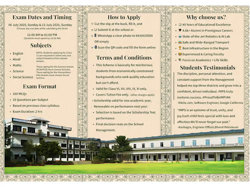
Condensing this much information — exam details, fee waivers, terms, and testimonials — into a single A4 was nearly impossible without losing clarity. So I restructured it into a roll-fold leaflet, balancing density with design. Every panel tells its part of the story — clear, compact, and complete.
2
249


Graphic designer creating compelling content for you.
Graphic designer creating compelling content for you.


View more →