BankPoint: Fintech Hero Page Concept
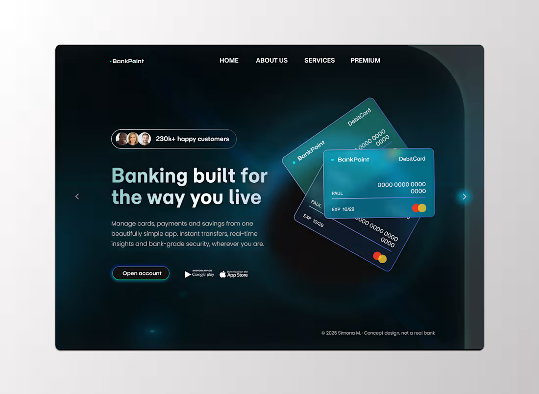
BankPoint is a landing page concept for a digital banking brand that wants to feel secure, modern and approachable at the same time.
The hero is built around a deep, dark canvas with soft teal glows, so the layered glass-style debit cards become the clear focal point. A social proof badge, a three-line headline and a single primary action guide the eye in seconds, while app store badges make the next step obvious.
3
521
Basketball Landing Page - UI/UX Design Concept
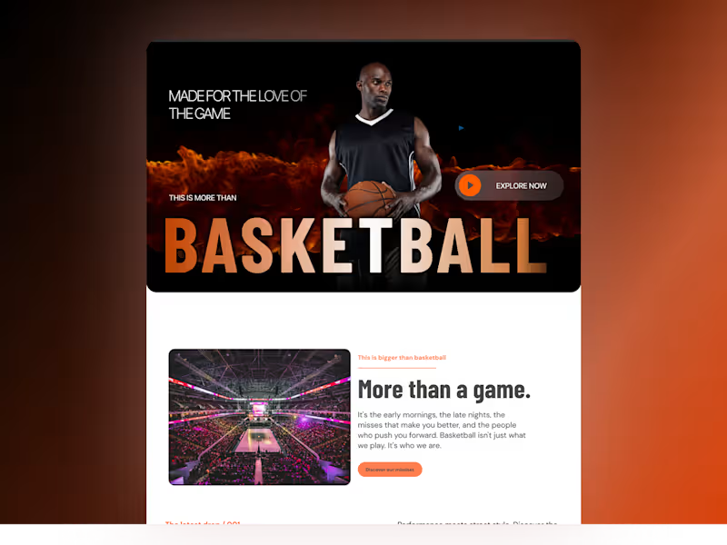
A bold, high-impact landing page concept inspired by basketball culture, combining athletic energy, oversized typography, and a clean, modern layout. Designed to showcase sportswear and performance gear through striking visuals, strong messaging, and a seamless user experience across devices.
Designed in Figma
3
429
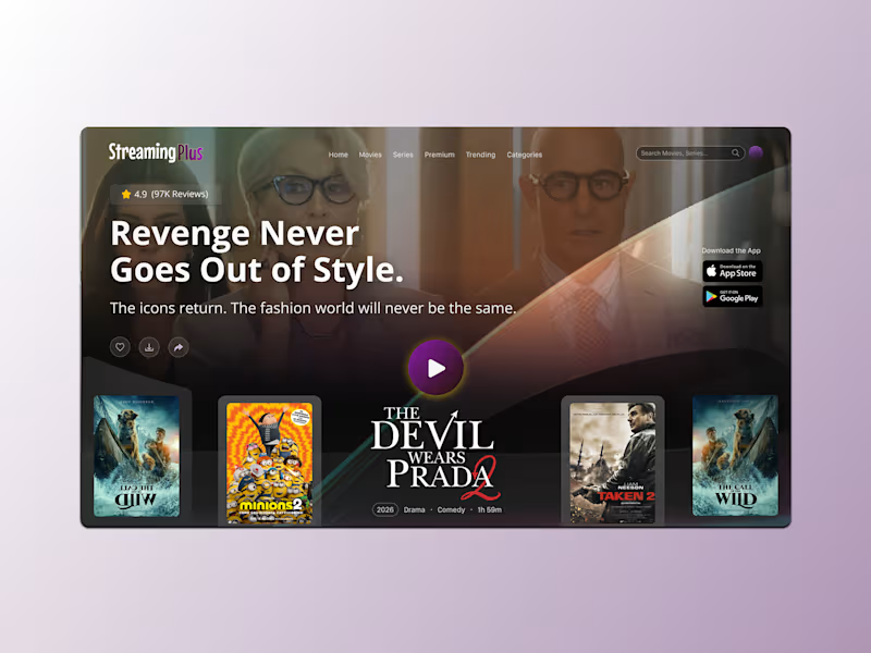
Hero Streaming Platform - UI Design
Designed a cinematic streaming platform UI featuring The Devil Wears Prada 2, with a bold hero section, editorial typography, and a premium visual direction inspired by modern entertainment platforms.
The concept focuses on creating an immersive viewing experience through strong imagery, clean layouts, and intuitive navigation.
Credits & Disclaimer
The movie title, logo, and promotional imagery belong to their respective copyright and trademark owners. All rights reserved. This project is an independent UI design concept created for portfolio purposes and is not affiliated with or endorsed by the film's creators or distributors.
4
4
461
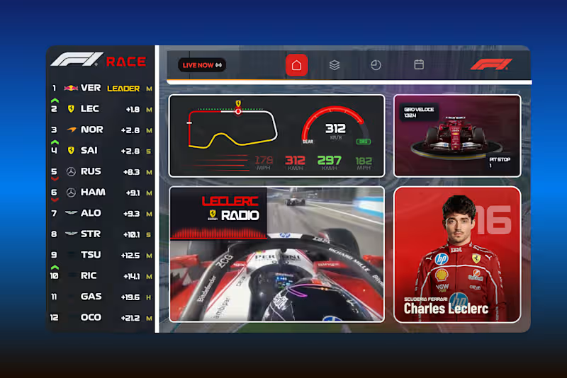
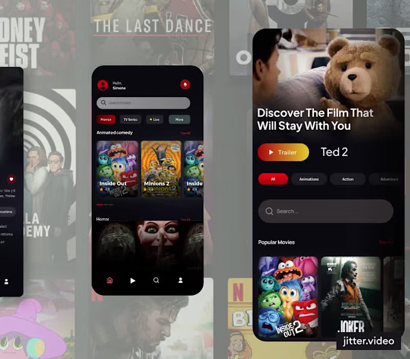
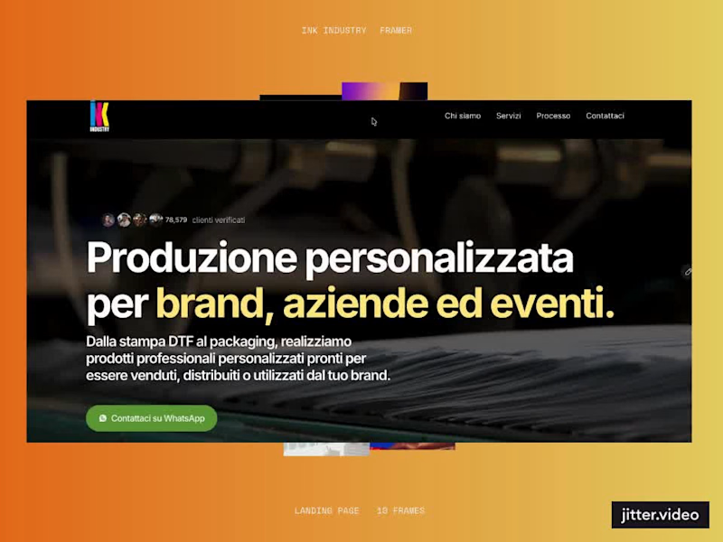
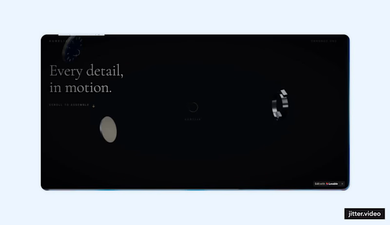
Aurelia - Chronos One
A luxury watch landing page built around one idea: instead of describing the product, you assemble it. Every section of the scroll reveals the watch's components, sapphire crystal, 316L steel case, in-house automatic calibre, floating in 3D space and coming together as you scroll, until the finished piece lands on the configurator.
Highlights:
Scroll-driven 3D assembly experience, with parts that float, rotate and lock into place
Cinematic dark aesthetic with elegant serif typography and subtle gold accents
Technical storytelling: specs presented as an integral part of the narrative, not a spec sheet
Frictionless ending: a clear "Configure yours" call to action at $4,200
Fully responsive, built end to end with Lovable (https://lovable.dev/)
https://screenshot-perfect-view-24.lovable.app
3
6
1.9K
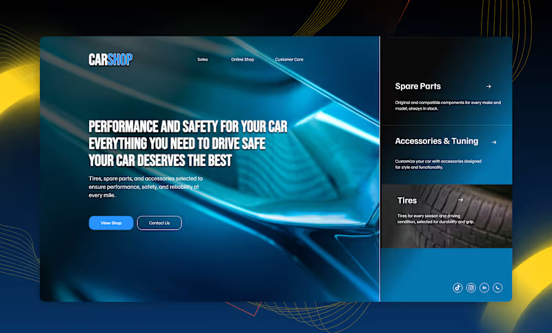
Hero Section - Car Accessories E-commerce 🚗
An hero section in Figma for an e-commerce site focused on tires, spare parts, and car accessories.
The goal was to communicate performance, safety, and reliability from the very first impression, while keeping a clean, conversion-focused layout: a bold headline, two clear CTAs (Shop Now / Contact Us), and a side section with info cards for the main categories (tires, spare parts, accessories).
Dark palette with metallic accents and bright yellow highlights to evoke energy and speed, paired with bold typography for a headline that immediately signals the brand's positioning.
2
2
890