Graphic Designer
Graphic Designer


View more →



Designer che mette l'anima nei loghi dei suoi clienti.
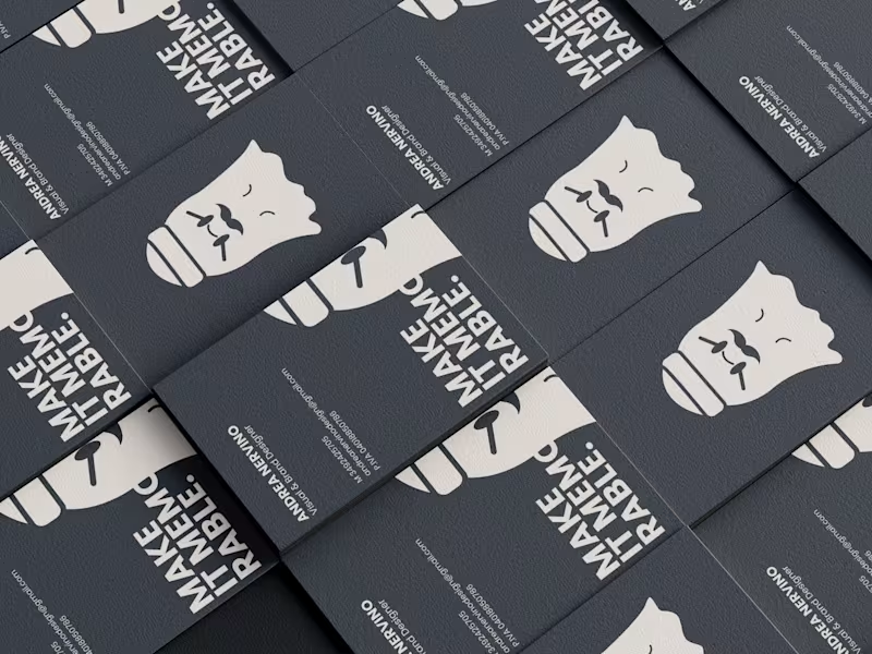
The ghost is the mascot of my personal brand: it represents my identity as a designer, with a cap and mustache nodding to my love of horror and my distinctive style. You'll find it on business cards, profiles, and brand materials, always paired with the claim "Make It Memorable."
0
202
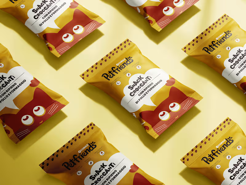
Note: This project is an independent packaging and branding concept developed for portfolio purposes. There is no official affiliation, sponsorship, or partnership between myself and Conad or Petfriends.
An independent packaging and visual design concept created for a cat snack line, designed to revamp the product's visual identity with a modern, playful, and emotionally engaging look. The design centers around bold, dynamic illustrations paired with a clean icon system at the top of the pouch that highlights key nutritional features, such as wheat and soy-free recipes, added vitamins and minerals, and low calorie content per treat. The line features distinct color palettes tailored to each flavor profile ranging from beef and veal to chicken and cheese, as well as salmon and trout ensuring clear shelf standout and achieving a seamless balance between typography, visual storytelling, and clear product messaging. What do you think?
0
78
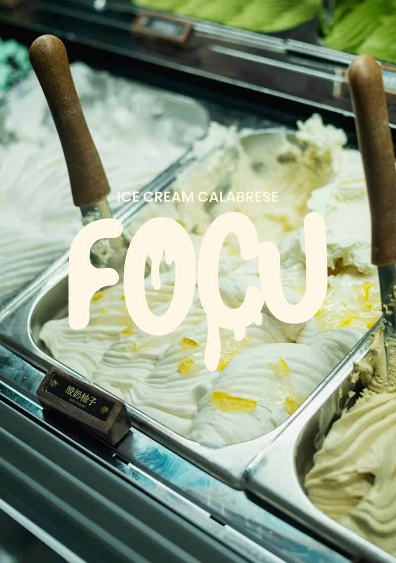
FOCU — Artisan Calabrian Gelato
FOCU is an artisan gelato brand rooted in the flavors and memory of Diamante, Calabria. Each jar carries a piece of the southern coast — bitter bergamot, sharp citrus, dark wild fig — translated into a bold, unapologetic visual identity. The name comes from the Calabrian dialect word for “fire” and “heat”: a deliberate choice to create a powerful contrast with the cold nature of gelato, sparking curiosity and surprise in the consumer.
The Design System: The brand system pairs a groovy pop aesthetic with a monochromatic color logic: one flavor, one color, one jar. Boogaloo typography, dripping cream shapes, and a deep magenta lid unify the three flavors of the line into a coherent family that feels artisanal.
Designed as a fictional brand for the Affinity “Fake Brand Real Craft” contest 2026.
18
18
758