The network for creativity
Join 1.25M professional creatives like you
Connect with clients, get discovered, and run your business 100% commission-free
Creatives on Contra have earned over $150M and we are just getting started
Back to feedPost

👋 Hello, everyone! I am very excited to share with you my first post in this space, in which I will delve directly into a key aspect of my work.
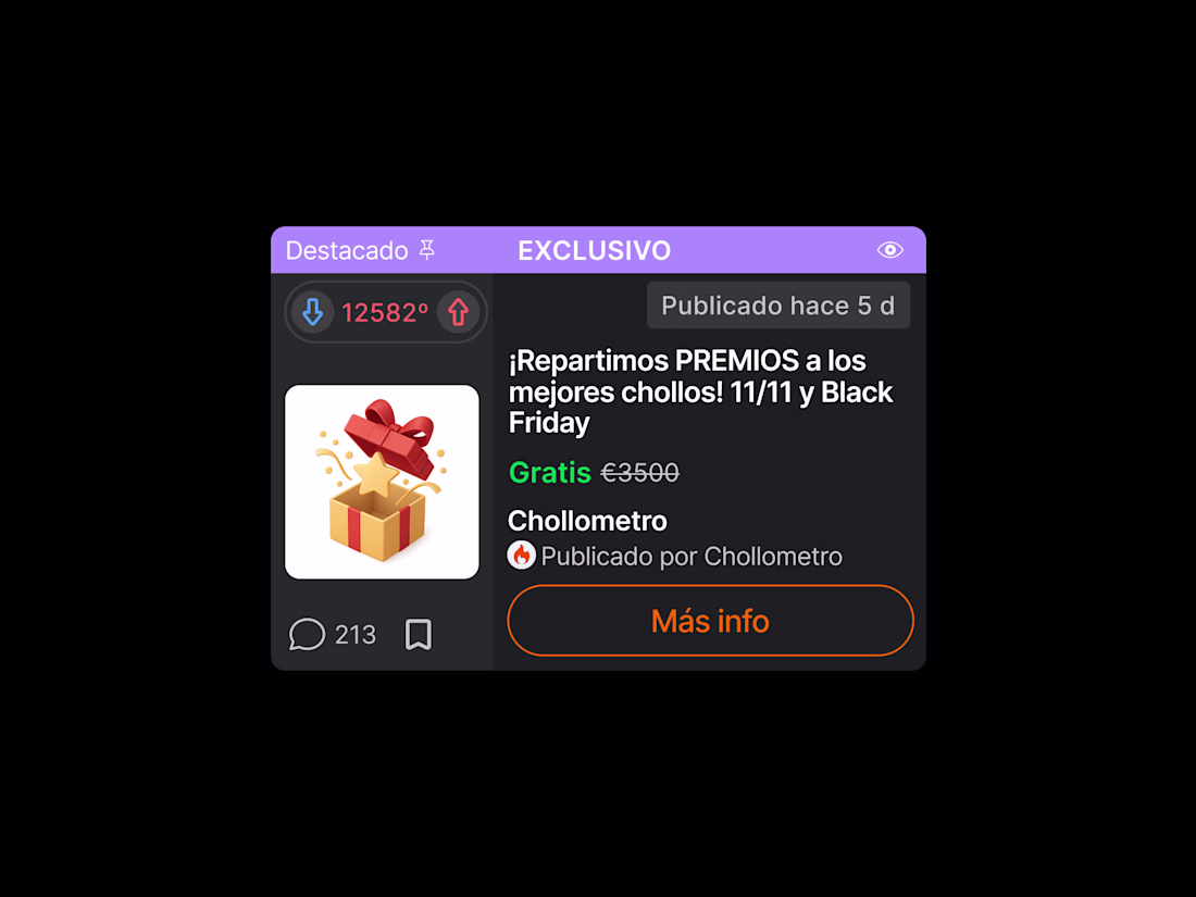
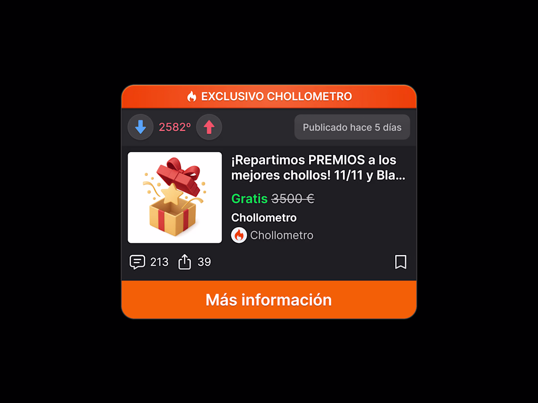
🤓 This use case presents a key excerpt from the product card redesign for the Chollometro app, focusing on establishing component consistency across the various card variants.
🔍 The comprehensive analysis addressed the lack of harmony in fundamental elements such as iconography, alignment, and margins (spacing), by applying visual hierarchy principles and reinforcing brand identity with the corporate colour palette.
👈 Original Product Card 🆚 New Proposal 👉


The network for creativity
Join 1.25M professional creatives like you
Connect with clients, get discovered, and run your business 100% commission-free
Creatives on Contra have earned over $150M and we are just getting started


Trending
maxearnings
The next frontier of payments is live on Contra. How are you maximizing revenue?
freelancerlife
Freelancer life is wins, pivots, and everything in between. What’s yours right now?
aidesignflow
AI tools are redefining how designer work. What does your workflow look like?
micrographics
Micrographics started as utility - barcodes, packaging, instruction labels. How would you use them?
aivideo
AI video tools are moving at warp speed. What tools are you using?