The network for creativity
Join 1.25M professional creatives like you
Connect with clients, get discovered, and run your business 100% commission-free
Creatives on Contra have earned over $150M and we are just getting started
Back to feedPost
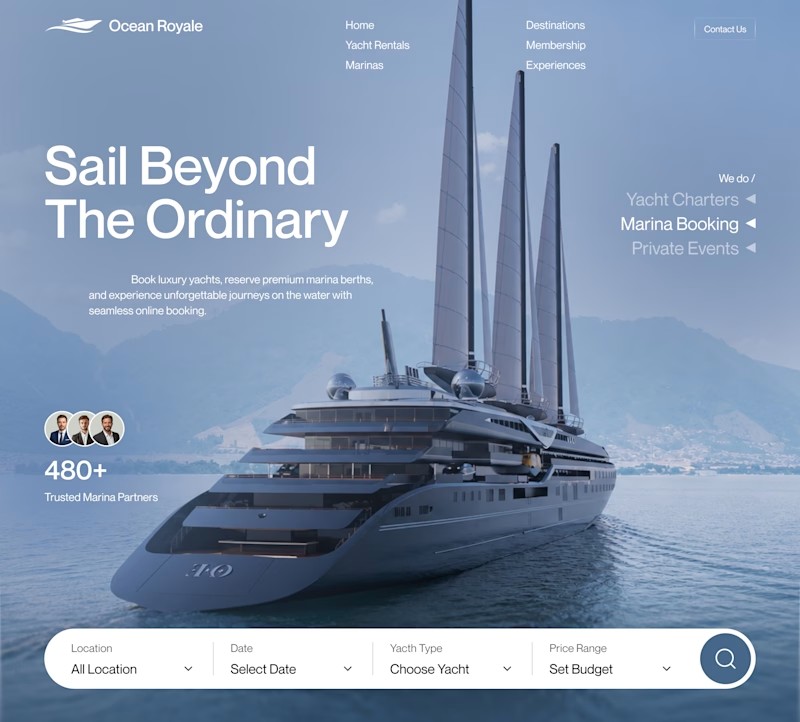
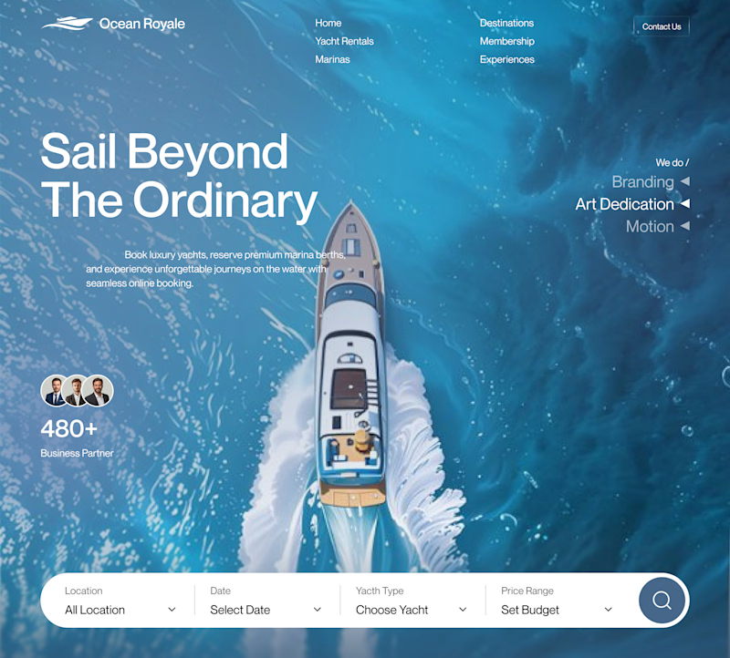
Animated Bento Grid. What do you think?


Good work


Thank you!

Absolutely amazing
Appriciate it Khunsa


Good work
Thank you Subash!

This animated bento grid is so satisfying to watch! The motion is smooth and the layout hierarchy works really well for showcasing multiple services at once. The dark, moody color palette adds a premium feel. Well done, Robin!

Haha, nice!

Very Creative, love it🙌

Excellent design ,colors & hover effects!

Good Work!

amazing work


Smooth camera movements

looks good

Great work

Just Amazing Robin🙌

So cool!

Wow so cool😍

Bento grid makes the design look so modern ,and adding animation on it... it's a cherry on top, Robin. Amazing

really nice work! love it

Smooth interactions

I can watch this all day long 😭 Is this a preview form ae, or actually animated in Webflow (I'd assume)?
AE 😉

Looks very amazing

I like this 😍

good work bro

Pure perfection!

Very smooth keyframing🚀

That is fire🔥


Oof now that's what I call premium


Robin you know my thoughts already 🔥
Thanks Ralph :)

Amazing motion graphic!

Solid motion game

So cool and aesthetically pleasing
The network for creativity
Join 1.25M professional creatives like you
Connect with clients, get discovered, and run your business 100% commission-free
Creatives on Contra have earned over $150M and we are just getting started





Related posts




Which hero visual feels right for this brand?
While working on the homepage for Halfspace, a website design and SEO agency, I explored two different hero visuals for the same headline and layout. Same message, same structure, just a different visual metaphor and mood.
Option 1 - Rocket Launch. Bold, literal, and energetic, visually reinforcing the "launch your business" message with motion and fire.
Option 2 - Glass Cube. Abstract, sleek, and premium, giving a more refined, tech-forward feel without relying on a literal metaphor.
Would love your honest UX/UI take, which direction feels more impactful, memorable, and aligned with a web design/SEO brand, and why?
11 voted
41%
16 voted
59%
27 votes
Closed

Both design are great; it's hard to choose one


Option B feels nothing but premium