The network for creativity
Join 1.25M professional creatives like you
Connect with clients, get discovered, and run your business 100% commission-free
Creatives on Contra have earned over $150M and we are just getting started
Back to feedPost
Taste Test

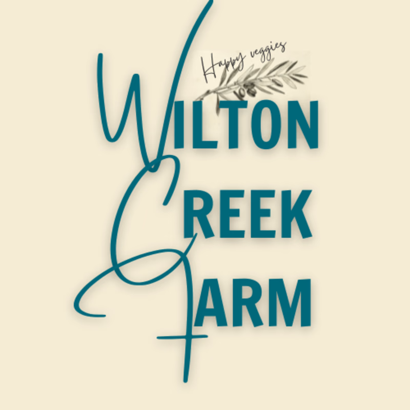
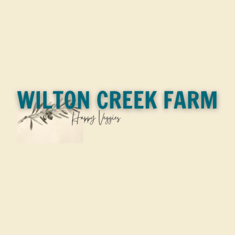

Both options are good.

I'd go with the traditional one. People might read 'reek' in the loopy one ;-] Also, may I suggest losing the drop shadow? Makes it look a bit more clean 🧽

Thanks, that was what I was leaning towards too. yesterday I started to think that the “creek” looked like “Greek”

Both are amazing! Maybe move the wheat on loopy from the top to the bottom of the "farm". Awesome design though!!
The network for creativity
Join 1.25M professional creatives like you
Connect with clients, get discovered, and run your business 100% commission-free
Creatives on Contra have earned over $150M and we are just getting started

Challenges
View all


