The network for creativity
Join 1.25M professional creatives like you
Connect with clients, get discovered, and run your business 100% commission-free
Creatives on Contra have earned over $150M and we are just getting started
Back to feedPost
Taste Test
For a resturant website, which do you prefer ux wise and why?
Please help me decide

5 voted
100%
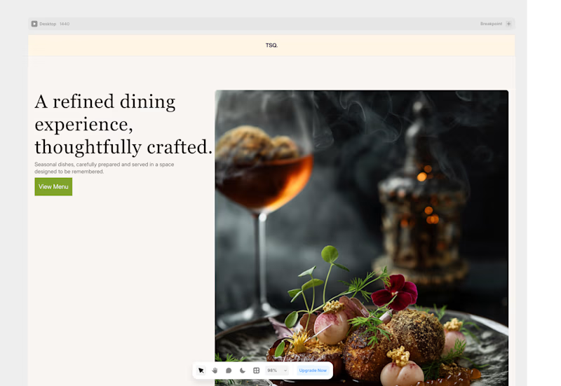
0 voted
0%
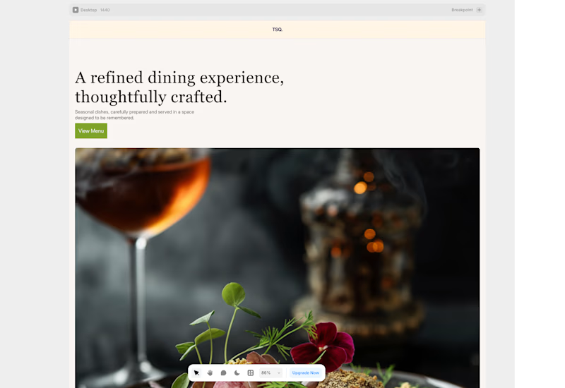
5 votes
Closed

layout 02 🙌

first one...curious to know why
In the first layout, I noticed the heading sits too close to the image that minimal space creates visual tension. I think it needs more breathing room or white space. Similarly, the spacing between the heading, subtext, and CTA feels cramped; they appear to be touching each...
thank you so much for this detailed feedback
really appreciate
The network for creativity
Join 1.25M professional creatives like you
Connect with clients, get discovered, and run your business 100% commission-free
Creatives on Contra have earned over $150M and we are just getting started





