The network for creativity
Join 1.25M professional creatives like you
Connect with clients, get discovered, and run your business 100% commission-free
Creatives on Contra have earned over $150M and we are just getting started
Back to feedPost
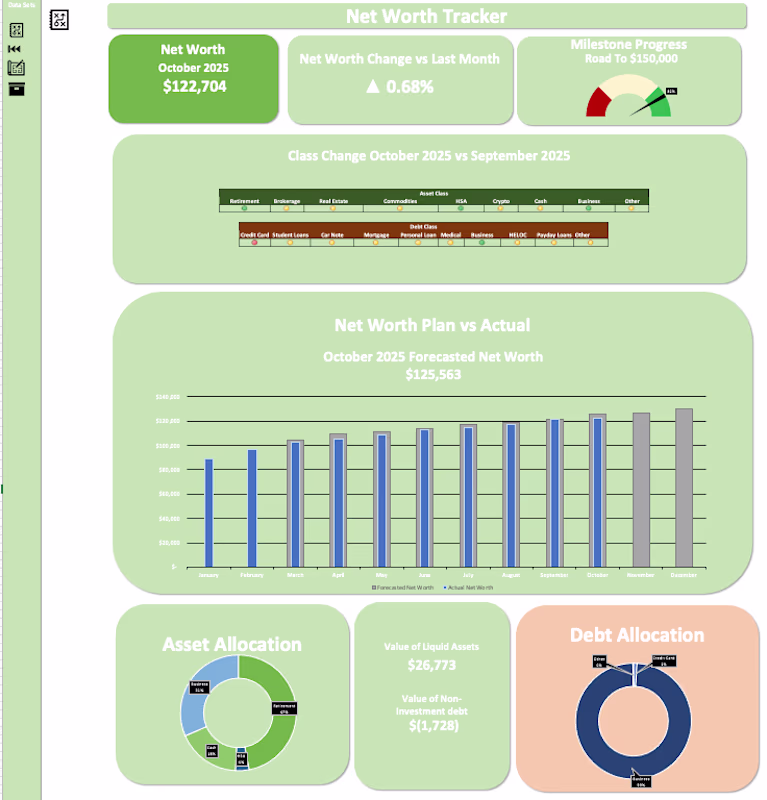
Tracking Net Worth has led to a ~$40K increase for this user in 10 months. I designed an Excel Dashboard that allows users to track their net worth & visualize where their assets & debts are.
Creating a pie chart for asset allocation allowed the user to understand he was concentrated in one asset class without needing to be. The user now has a more diversified asset allocation between their business, retirement, cash, and their HSA by dividing their contributions to each account.
Additionally, I added a forecast function to the dashboard where depending on the amounts added by the user, it will forecast future values. This was built into the model to motivate the user to continue contributing to their accounts.
Visualizing this data has helped the user focus on his goal of growing his net worth.
Very well executed. Translating net worth data into clear visuals like asset allocation and forecasts makes a real difference in decision-making. The forecasting element is especially strong — it turns the dashboard into a planning and motivation tool, not just a reporting one.
This is a great example of how visualization changes behavior. The forecasting element is especially powerful — once people can see future outcomes, consistency becomes much easier. Really well thought out dashboard.
The network for creativity
Join 1.25M professional creatives like you
Connect with clients, get discovered, and run your business 100% commission-free
Creatives on Contra have earned over $150M and we are just getting started
Related posts
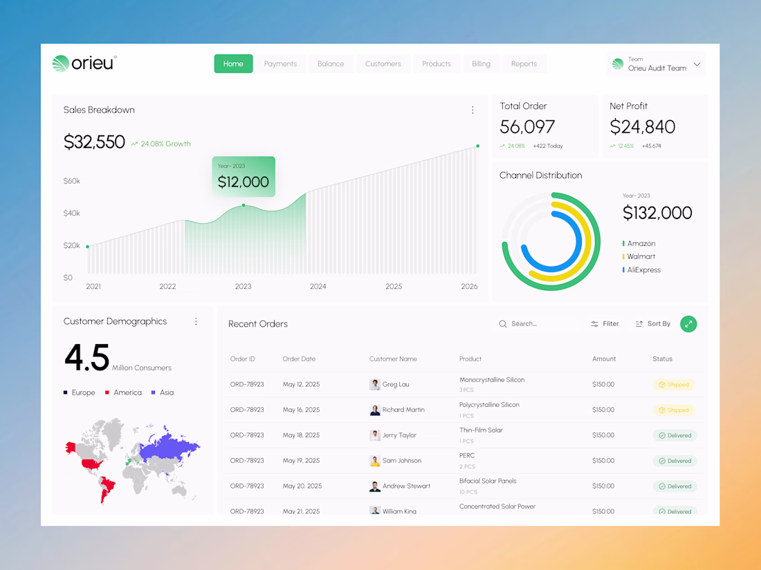
Most dashboards become harder to use as they scale.
Orieu was designed to move in the opposite direction.
A solar sales intelligence dashboard built to simplify how renewable energy businesses track revenue, monitor orders, analyze customer activity, and manage operational performance.
The experience focuses on:
• Clear analytics visualization
• Lightweight navigation
• Structured operational workflows
• Minimal eco-inspired UI
• Faster decision-focused interaction
The challenge wasn’t adding more features.
It was organizing complexity into something users can understand instantly.
Because in SaaS products, usability directly impacts business efficiency.
Currently available for SaaS dashboard, analytics platform, and web app design collaborations. Let’s build a product your users actually enjoy using.
Product DesignUI DesignAdobe PhotoshopFigmaAdobe IllustratordashboarddesignsolarsystemAI VIsual Designersolarenergydesign
Clean 👌🏻
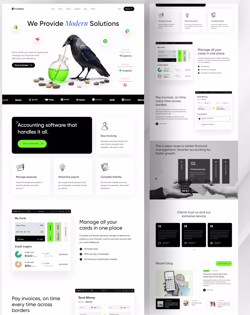
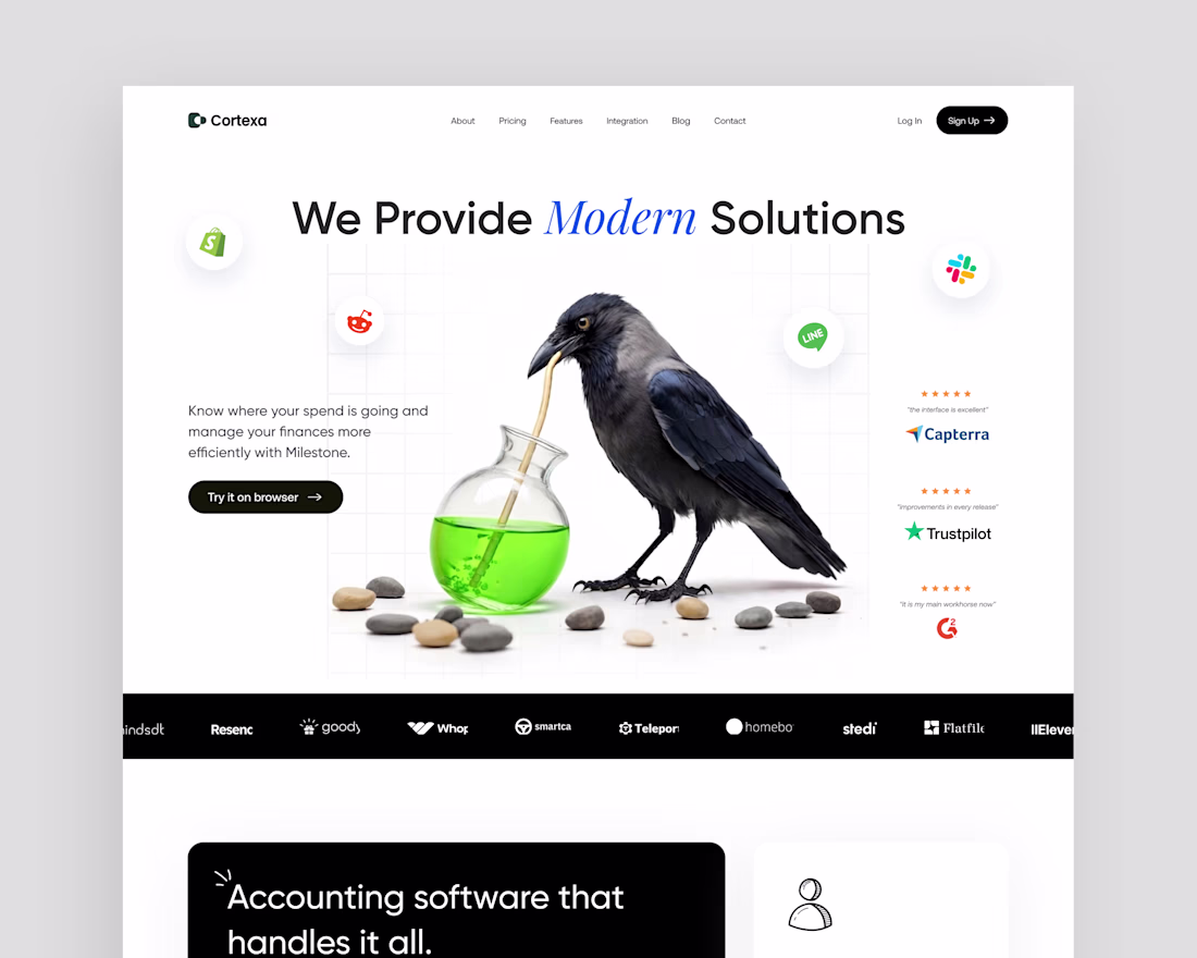
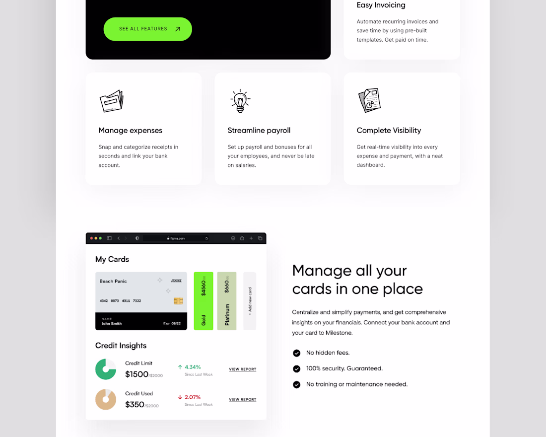
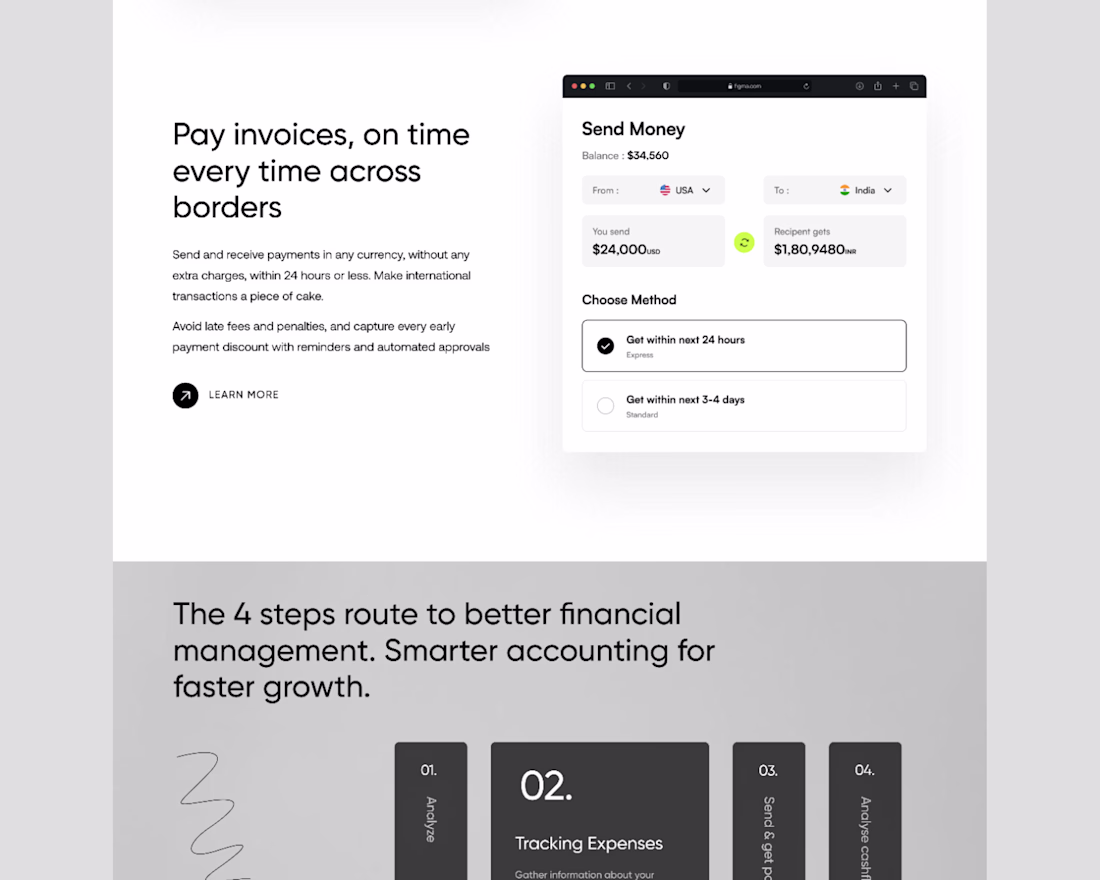
Framer-Built Fintech SaaS Website for Accounting & Financial Management (Cortexa)
I specialize in designing and developing high-performance Fintech SaaS websites using Framer, focusing on intuitive UI/UX for complex financial solutions. This project, "Cortexa," showcases my expertise in creating a modern, secure, and highly functional platform for accounting software and financial management.
My role involved comprehensive UI/UX design, strategic layout planning, and custom Framer development to ensure a seamless user journey. The primary challenge was to present sophisticated financial tools such as expense management, payroll streamlining, and cross-border invoicing in an accessible and visually engaging manner. I leveraged Framer's advanced capabilities to create dynamic interfaces, interactive data visualizations, and a responsive design that ensures optimal performance across all devices. The impact was a highly engaging, conversion-optimized website that effectively communicates Cortexa's value proposition, drives lead generation, and establishes their authority in the Fintech SaaS market.
Keywords: Framer, Framer Website Design, Framer Developer, Framer Expert, Framer UI/UX, Framer Prototyping, Framer Animation, Framer Interactions, Framer Responsive Design, Framer SaaS Website, Framer Fintech Website, Framer B2B Website, Framer Landing Page, Framer Portfolio, Framer Web Design, Fintech Web Design, SaaS Web Design, Financial Technology Website, Accounting Software Website, B2B SaaS Website, Startup Website, Tech Startup Website
Trending
Claude
Claude has entered the design space. How are you using Claude Design?
Contra University
Learn from expert creatives how to earn more using next-gen AI tools.
creativeaiflow
Creative AI workflows are evolving. What tools do you use, and what are their strengths and weaknesses?
portfolioreview
The best portfolios tell a story, not just show a grid. Share yours for feedback.
freelancerlife
Freelancer life is wins, pivots, and everything in between. What’s yours right now?