The network for creativity
Join 1.25M professional creatives like you
Connect with clients, get discovered, and run your business 100% commission-free
Creatives on Contra have earned over $150M and we are just getting started
Back to feedPost
Taste Test


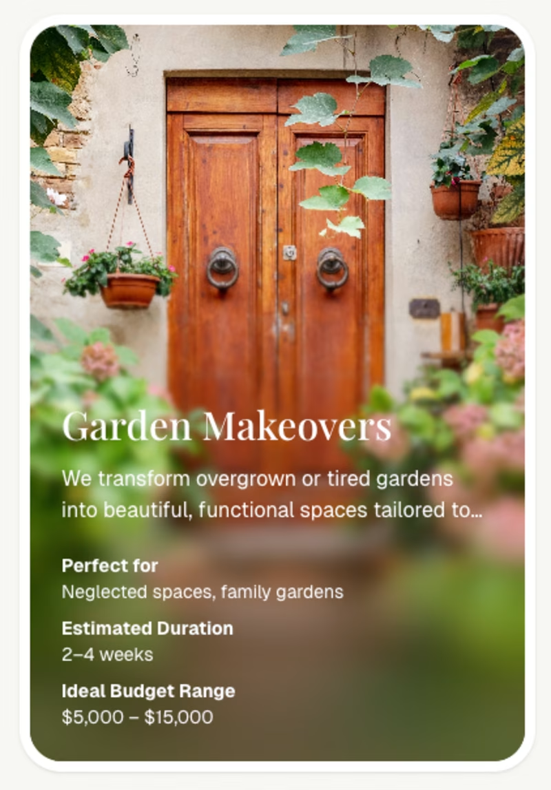
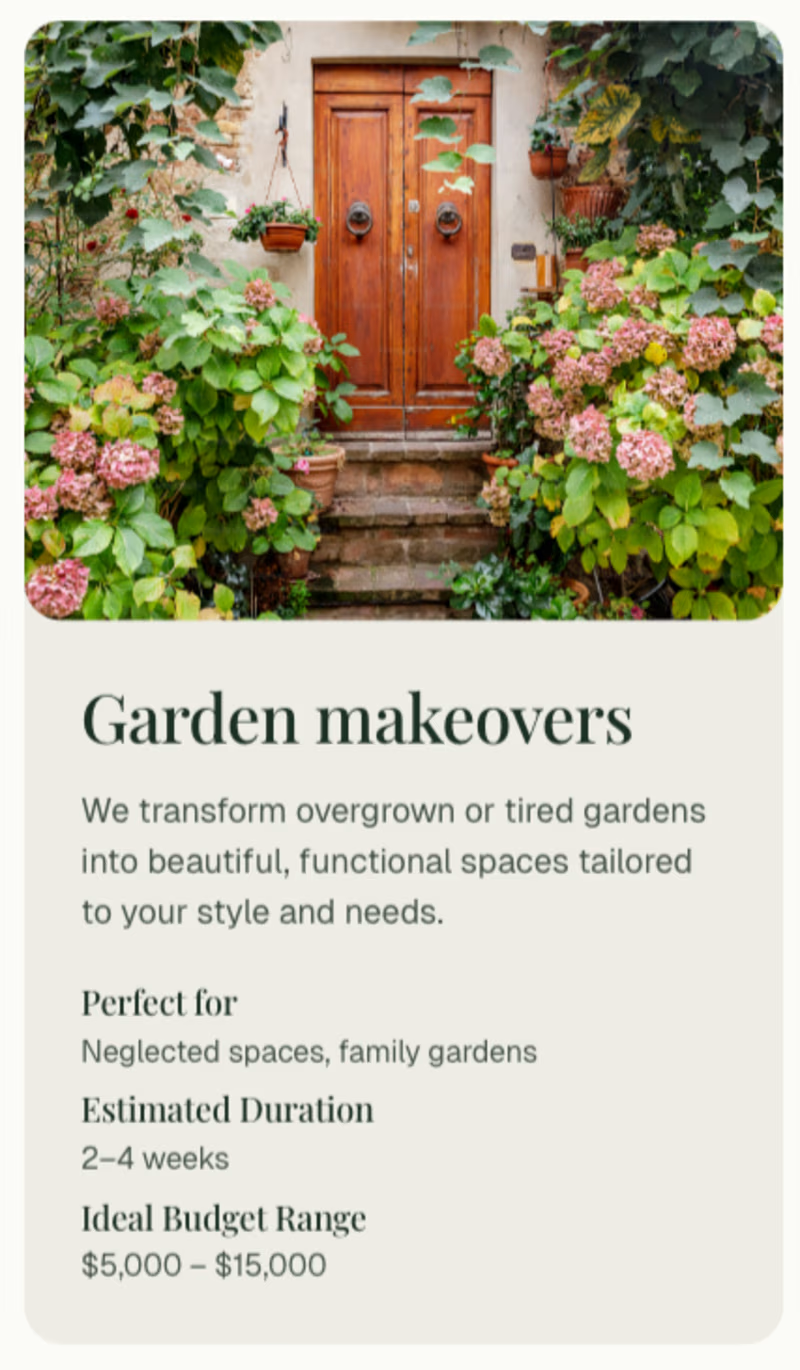

I'd have to actually vote the original.
Even though the left one seems better, the white text gets lost in some part of the image, especially the bold text is kind of harder to read.

thanks for your suggestion i will update 👍👍

Blur card has more of the garden, and still has the text content (although I'd think using some shadow for the white text to make sure that it has enough readability on all images) 👍

Blur Card looks awesome 🔥 🔥 🔥


I’d go with the Blur card.
It feels more modern and premium, and the overlay helps the text stand out while keeping the visual focus on the image Clean work overall 👌
Thanks everyone who’s giving me suggestions i will more better my card 👍👍😇😇
The network for creativity
Join 1.25M professional creatives like you
Connect with clients, get discovered, and run your business 100% commission-free
Creatives on Contra have earned over $150M and we are just getting started




