The network for creativity
Join 1.25M professional creatives like you
Connect with clients, get discovered, and run your business 100% commission-free
Creatives on Contra have earned over $150M and we are just getting started
Back to feedPost
Vetra — Natural Skincare Brand Identity & Visual System
Most skincare brands default to clinical white or earthy brown the shelf is full of both, and neither stops the scroll. Founders positioning a natural skincare line get trapped between looking too organic or too sterile; neither builds the desire that converts a first-time buyer.
The Solution:
We designed Vetra, a full brand identity system for a natural skincare line targeting women who want clean beauty without compromise. Built on a sage-to-cream color ramp, Achemost serif, and a botanical leaf mark every touchpoint from product tube to campaign portrait lives in the same visual world without needing explanation.
What we focused on:
Color Palette: Four-stop gradient from off-white cream through sage to deep forest green warmth at light tones, authority at dark.
Achemost Serif: High-contrast display typeface used across wordmark and headlines; luxury-legible at every scale.
Logo Mark: Minimal leaf silhouette paired with the Vetra wordmark holds as a standalone icon or embossed on packaging.
Product Card: Rounded sage card with cream tube, linen pouch, 4.5-star rating, 11.5k reviews, and "Explore Now" CTA.
Campaign Portrait: Studio photo with tagline "Smooth as silk, pure as nature" brand voice and visual direction in one frame.
Tools: Figma and Jitter
The network for creativity
Join 1.25M professional creatives like you
Connect with clients, get discovered, and run your business 100% commission-free
Creatives on Contra have earned over $150M and we are just getting started
Related posts
New branding project in the works! 🚀
I'm loving this one, it's giving me such high-energy. ✨
What do we think? 👇
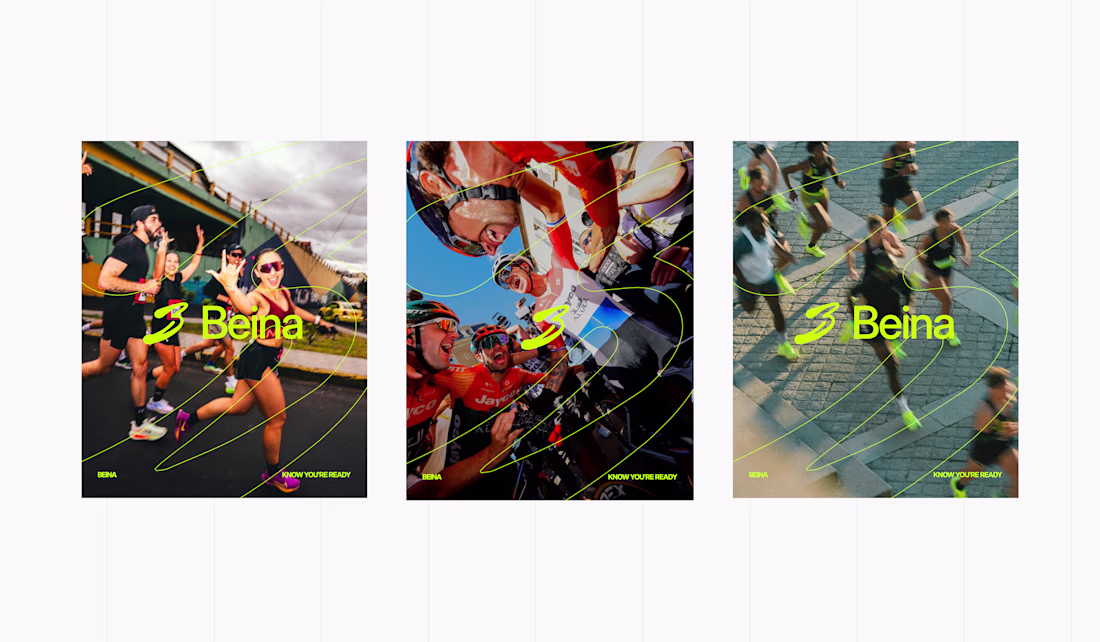
This is superb
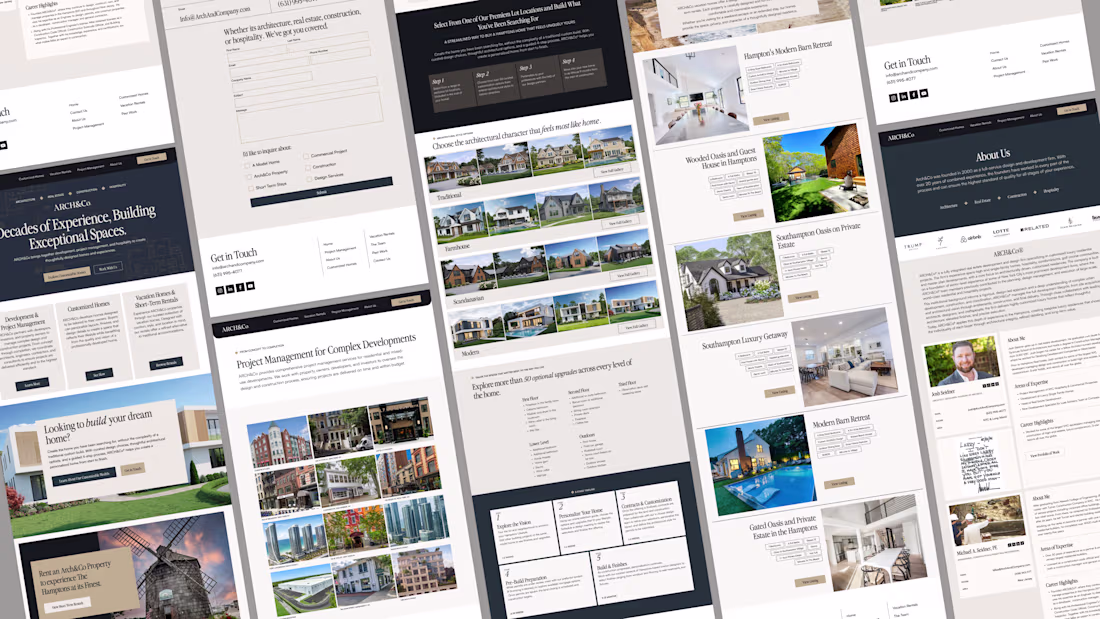
I had a great time working on this super clean, modern & sophisticated web design and development project with an old friend. Designed in Figma , Built in Webflow.

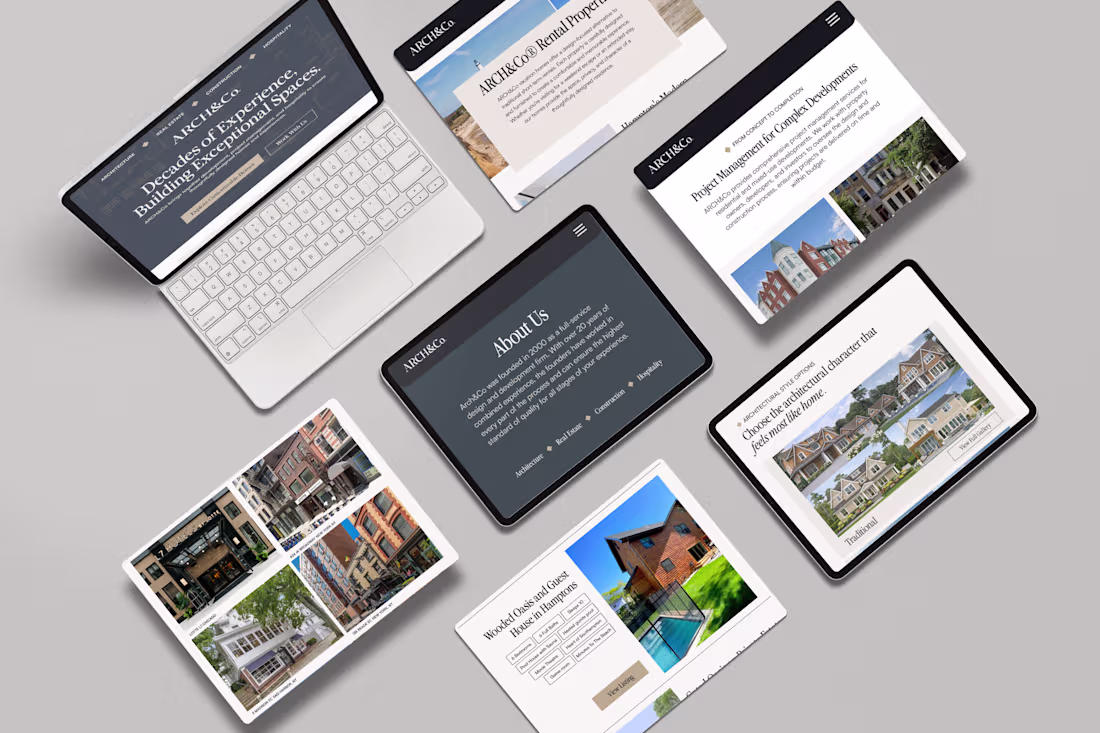
Creative 😍
Organic Herbal Tea E-Commerce Website Design
This project is a modern e-commerce website designed for an organic herbal tea brand. The website presents herbal infusion products with a calm, natural, green visual style that matches the brand identity. It includes a landing page, product showcase, product detail page, contact section, cart flow, and checkout-style interface.
The main goal of this work was to create a clean and trustworthy online shopping experience for natural wellness products. The design focuses on strong product presentation, smooth navigation, readable content sections, and a consistent visual atmosphere using herbal imagery, soft green backgrounds, and simple call-to-action buttons.
The project demonstrates both UI/UX design and web development skills, including responsive layout planning, product card design, product detail structure, cart interaction, checkout form design, and brand-focused frontend implementation.
Recommend.
Trending
Claude
Claude has entered the design space. How are you using Claude Design?
Contra University
Learn from expert creatives how to earn more using next-gen AI tools.
creativeaiflow
Creative AI workflows are evolving. What tools do you use, and what are their strengths and weaknesses?
portfolioreview
The best portfolios tell a story, not just show a grid. Share yours for feedback.
freelancerlife
Freelancer life is wins, pivots, and everything in between. What’s yours right now?