The network for creativity
Join 1.25M professional creatives like you
Connect with clients, get discovered, and run your business 100% commission-free
Creatives on Contra have earned over $150M and we are just getting started
Back to feedPost
Why most websites fail in the first 5 seconds?
A visitor lands on your site.
They don't read. They scan. They're asking three things instantly:
-What is this?
-Is it for me?
-What do I do next?
If your hero section doesn't answer all three in under 5 seconds, they're gone. Back button. Competitor's site. Done.
Most businesses pack their homepage with vague taglines, stock imagery, and a "Learn More" button that leads nowhere meaningful.
Meanwhile, the sites that actually convert do something different. They lead with clarity. A sharp headline that speaks directly to the visitor's problem. A subheadline that positions the solution. And a CTA that tells them exactly what happens next.
No mystery. No friction. No guessing.
The hard truth is that people don't leave your site because your design is ugly. They leave because they're confused. Confusion kills conversions faster than bad colors ever will.
Before you invest in a redesign, run this test: show your homepage to someone who's never seen it for exactly 5 seconds. Then close it. Ask them what you do, who it's for, and what they're supposed to do next.
If they can't answer all three, your website isn't converting. It's just existing.
The first 5 seconds aren't part of the experience.
They are the experience.
The network for creativity
Join 1.25M professional creatives like you
Connect with clients, get discovered, and run your business 100% commission-free
Creatives on Contra have earned over $150M and we are just getting started
Related posts
This week will be great, I love the design
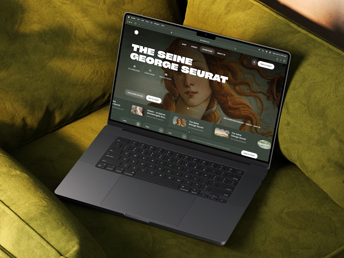
I build websites.
Not just websites that look good. Websites that load fast, communicate clearly and turn visitors into clients.
Every site you just saw was custom designed and custom built entirely in Framer. No templates. No shortcuts. No compromise. Just intentional design from concept to launch.
If your business needs a website that actually works, let's talk.
Well done
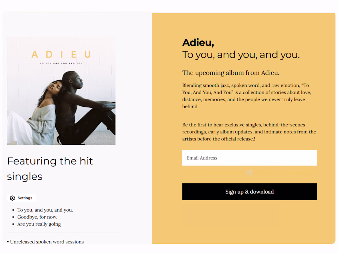
This wasn’t an ecommerce project.
The goal was simple:
Create a clean experience where listeners could connect with the artist, join the list, and download the music project directly.
Built entirely with Kit.
We designed the page to feel like part of the album itself; minimal, emotional, and immersive.
Simple layout.
Strong storytelling.
Smooth subscriber journey.
Sometimes the best creative work happens when you keep things focused and intentional.
Trending
Claude
Claude has entered the design space. How are you using Claude Design?
Contra University
Learn from expert creatives how to earn more using next-gen AI tools.
creativeaiflow
Creative AI workflows are evolving. What tools do you use, and what are their strengths and weaknesses?
portfolioreview
The best portfolios tell a story, not just show a grid. Share yours for feedback.
freelancerlife
Freelancer life is wins, pivots, and everything in between. What’s yours right now?