The network for creativity
Join 1.25M professional creatives like you
Connect with clients, get discovered, and run your business 100% commission-free
Creatives on Contra have earned over $150M and we are just getting started
Back to feedPost

This year 2026, let me redefined your projects and scale it up as I'm opened to work for mobile app websites of different aspect.
The network for creativity
Join 1.25M professional creatives like you
Connect with clients, get discovered, and run your business 100% commission-free
Creatives on Contra have earned over $150M and we are just getting started











Related posts

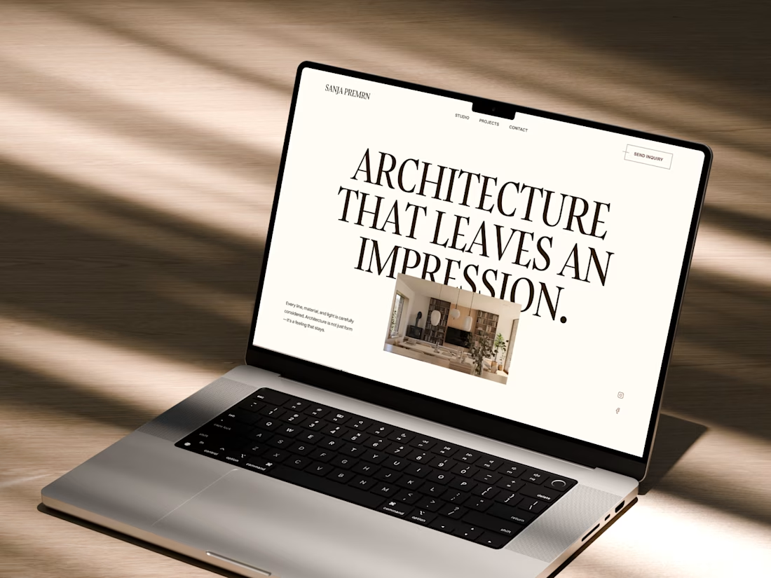
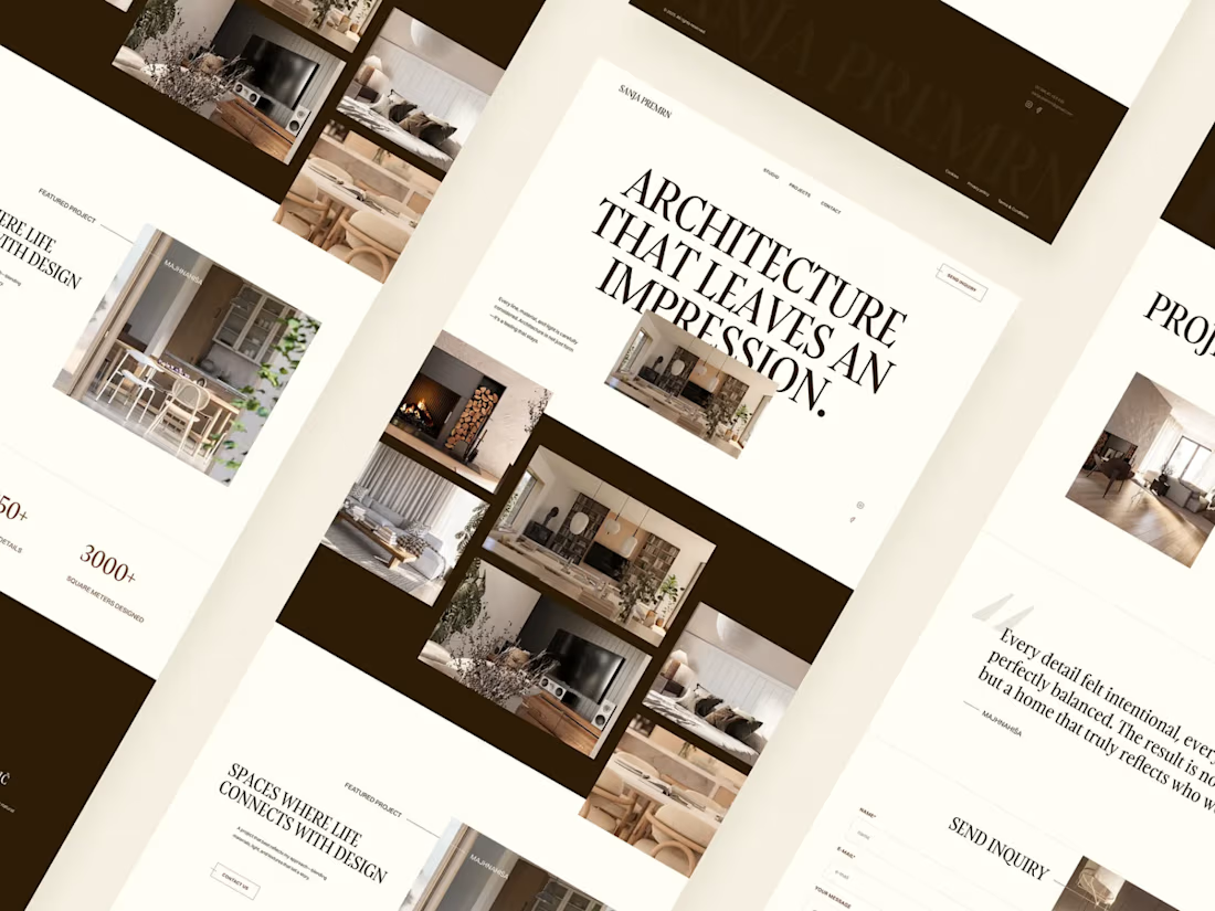
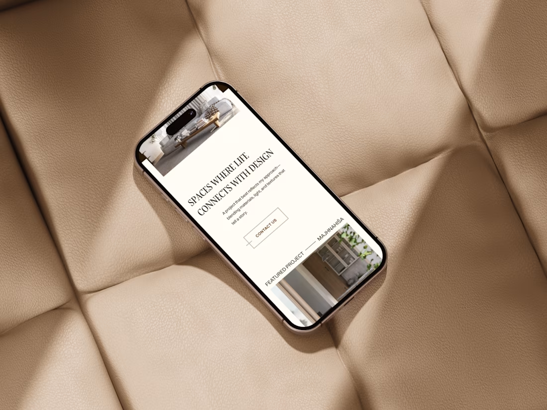
Web design for Architectural studio in Slovenia!
Read more in my case study:)
#architect #architecturalstudio #mobile #responsive #uidesign #webdesign #mockup #laptop #desktop #homepage #modernui #sleekui #cleanui #premiumui #premiumfeel #elegant

🚀 Your Business Deserves a Better Website!
Looking for a modern, professional website that looks great on every device?
I help businesses turn their ideas into clean, responsive, and user-friendly websites using WordPress and Elementor.
✨ My Services:
WordPress Website Design
Elementor Website Development
Business & Portfolio Websites
Landing Page Design
E-commerce Websites
Website Redesign & Improvements
💻 Clean design. 📱 Mobile-friendly layouts. ⚡ Performance-focused development.
Let’s build a website that represents your brand and helps your business grow!
🤝 Need a website? Let’s connect on Contra.
#WordPress #Elementor #WebDesign #WebDevelopment #Contra #FreelanceWebDesigner




Nice presentation, Shahroz. The services grid with the little icons makes it instantly clear what you do, and the 100% client satisfaction plus on-time delivery badges answer the questions every business owner has before they even ask. What kind of project tends to come through the door most for you, redesigns or fresh builds?

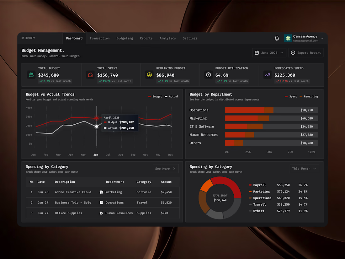
Monify is a modern budget management dashboard designed to help teams monitor spending, track budgets, and understand financial performance in one focused workspace. The interface combines budget utilization, expense tracking, spending forecasts, department-level breakdowns, and budget vs. actual analytics through intuitive data visualization. With a sleek dark mode UI, monospaced typography, bold red-orange charts, and structured financial metrics, Monify makes complex budget management feel clearer, more organized, and easier to navigate.
📩 Collaborate with Us? Contra Cansaas Agency