The network for creativity
Join 1.25M professional creatives like you
Connect with clients, get discovered, and run your business 100% commission-free
Creatives on Contra have earned over $150M and we are just getting started
Back to feedPost
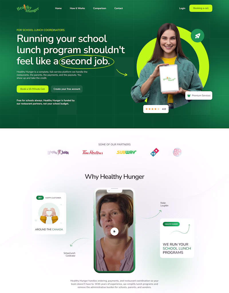
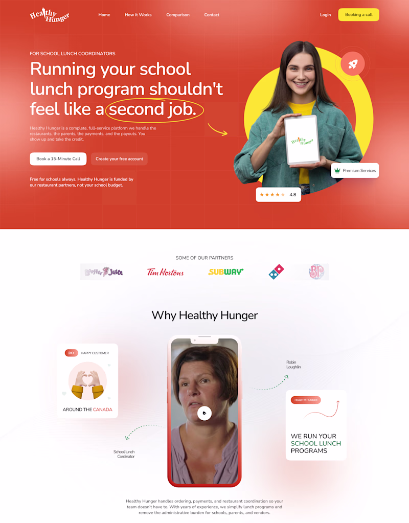
Taste Test
🎨 Design Poll: The Power of Color
It's interesting how a simple color change can completely shift the perception of a brand.
I designed the same hero section in two different color directions:
🟠 Orange Version: Bold, energetic, and attention-grabbing.
🟢 Green Version: Fresh, modern, and growth-oriented.
Everything else remains the same, yet each version tells a slightly different story and creates a different first impression.
If you were launching this brand today, which direction would you choose and why?
15 votes
Ends in 1d
Going with Green
green is looking like green flag:🔥
big on the orange–– i rarely find myself drawn to the color even just personally, so my lean surprises myself here a bit, lol. i'd say this is probably because it IS more energizing & commands the eye, which brings to mind the aim of setting a goal into motion with true ferocity & fiery intention.
Voted green. For a school lunch program targeting admins and parents, green reads as trustworthy and health-forward. Orange would probably land better if this were a consumer fitness app.
Going with the green version, because it is giving nature calm vibes
Orange looks "Sporty" so I'll go with Green 🍏
Voted Green
I would go with Orange version.
The network for creativity
Join 1.25M professional creatives like you
Connect with clients, get discovered, and run your business 100% commission-free
Creatives on Contra have earned over $150M and we are just getting started
Related posts
Just shipped my new portfolio.
Not another generic designer site. This one actually aligns with my brand, the tactical operator.
Built it while grinding CXC, pulling all-nighters, and refusing to stay average.
Feedback is appreciated.
This looks good!
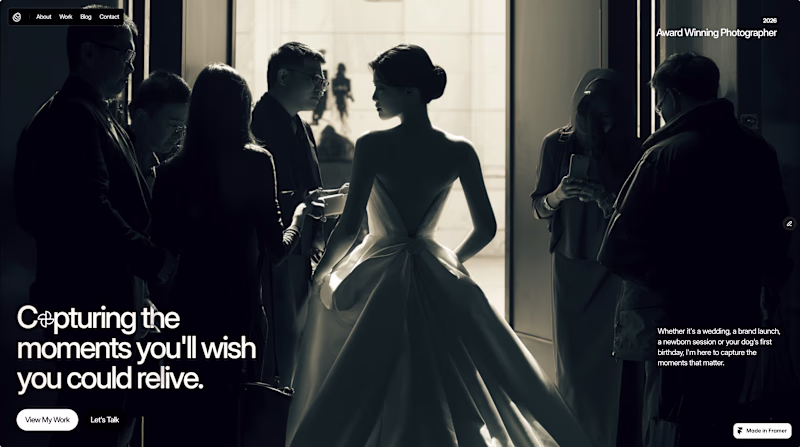
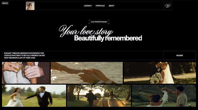
Exploring 2 different directions for a photographer's website. These are still work in progress and not the final versions, but I would love to know which direction feels stronger to you.
Drop your pick in the comments 👇
16 voted
80%
4 voted
20%
20 votes
Closed
Will go for cinematic😊
Testing out some new tools today and ended up with this project. The core idea is a mashup between the classic Pokedex—specifically its ability to scan and display item rarity—and a high-end rare sneaker marketplace. Instead of Pokémon, it’s all about tracking and auditing sneaker data.
I started with a simple prompt and kept iterating by feeding it reference images, refining the details until it hit the right vibe.
For the interface, I went for a 'slideshow' feel using D-pad controls to interact with the cards. Honestly, it took me hours to get that button logic locked in—it’s not 100% pixel-perfect yet, but it works, and that’s a win for today! HEHE
The design leans into Neo-Retro Brutalism, blending 90s hardware sensibilities with modern UI patterns. Through a Skeuomorphic-System approach, the interface mimics a proprietary firmware environment—using a terminal-first aesthetic and data-dense layout to create a physical sense of 'system presence' rather than just a flat web page.
Overall, this tool is an absolute beast for brainstorming and visualizing web concepts. It’s been a game-changer for getting ideas out of my head and into a playable prototype. It really bridges the gap between 'just a static image' and 'a fully interactive system.
Beautiful ❤️
Challenges
View allTrending
Claude
Claude has entered the design space. How are you using Claude Design?
Contra University
Learn from expert creatives how to earn more using next-gen AI tools.
creativeaiflow
Creative AI workflows are evolving. What tools do you use, and what are their strengths and weaknesses?
portfolioreview
The best portfolios tell a story, not just show a grid. Share yours for feedback.
freelancerlife
Freelancer life is wins, pivots, and everything in between. What’s yours right now?